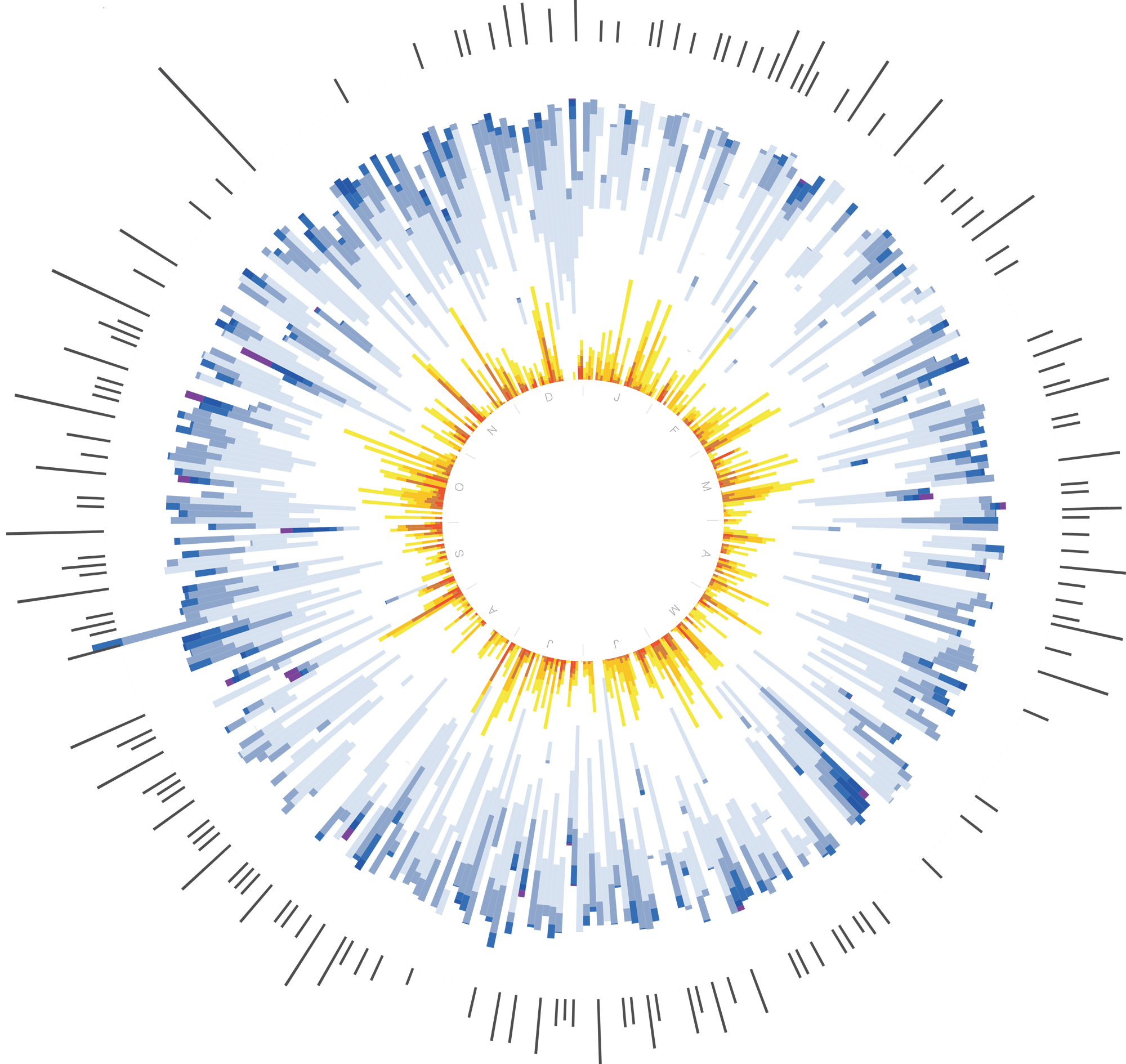
In 2012, Doug Kanter—diabetic since age 12—visualized his disease. He wrote software to compare his blood sugar with his activity and food. He says the feedback made for the healthiest year of his life. At the end of the project, he created this visual summary. The lengths of his running sessions appear around the outside in gray, and 91,251 glucose-monitor readouts form the iris in the center. Low blood sugar is orange, on-target appears white, and high is blue. Inspired by the experience, he created an app and visualization service called Databetes to help other diabetics.
***
Got a smartphone in your pocket? New apps collect your data and show you what it says—beautifully.
The Reporter. This app helps users build a database of their own habits and moods by requesting data via iPhone alert at random times throughout the day. Then it helps users visualize their digital selves with Feltron Annual Report–style charts.
Move-o-scope. Running in the background of a smartphone, the Moves app tracks the activity level and location of its users. The website Move-O-Scope, by design studio Halftone, renders the default Moves timeline as a brightly colored map, so users can see the patterns in their lives.
Meal Memory. For diabetics, the Meal Memory app—by Databetes creator Douglas Kanter—visually correlates food data with blood-sugar readings to help users understand how their meals affect their health.
See all 15 of our favorite recent data visualizations here.
This article was originally published in the November 2014 issue of Popular Science, under the title, “Dawn of the Data Age.”

