We are awash with data, and it keeps piling up: Some analysts estimate the amount of digital information in the world now doubles every two years. The growing tidal wave will require automation—a shift some have called the Industrial Revolution of data—to collect and analyze it all. But mountains of automated data won’t amount to much if we can’t understand it. Enter the emerging field of visualization.
Data visualization allows viewers to see the patterns in reams of numbers. It’s the craft of simplifying the complex. Done poorly, it confuses, misleads, or even lies. Done well, it elucidates—serving as a window into hidden relationships and trends. The most innovative visualizations come from areas rich with easily gathered information, and perhaps no spheres are more quantified than our selves, our cities, and our planet.
To honor that work, we chose 15 visualizations in these areas, selected from a field of 46 contenders. We hope these signal the direction of the new data age—that the revolution will be visualized.
(Peruse the full list of our judges’ favorites, below, or get an overview using the gallery, above.)
Our Judges
Popular Science assembled a panel of data-visualization experts—practicing designers at the forefront of the field—and asked them to rate candidate visualizations, chosen for their novel graphic forms, smart execution, or comprehensive underlying data.
Wes Grubbs directs Pitch Interactive, a visualization studio in Oakland, Calif. Pitch Interactive mapped international water conflicts for the June issue of Popular Science.
Giorgia Lupi is design director and co-founder of the Accurat design agency, based in Milan and New York City. Her studio contributed the visualization “A Shift in Nuclear Powers” in September.
Jan Willem Tulp runs the visualization studio TULP Interactive based in The Hague, the Netherlands. He created “Hungry Planet” for the magazine’s November 2013 issue.
Our Favorite Visualizations
Self
Feltron Annual Report
Stephen Wolfram’s Personal Analytics
One Human Heartbeat
Run Drawings
City
NYCHenge
TimeMaps
Crisis Mapping
Sky Color
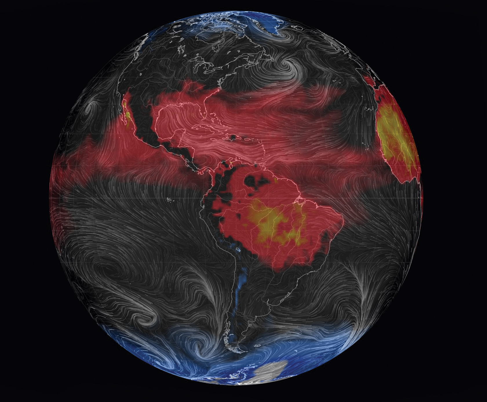
World
The Geography of Twitter Replies
World Population
Population Lines
This article was originally published in the November 2014 issue of Popular Science, under the title, “Dawn of the Data Age.”


