
Last summer, California was a model for how to handle the pandemic. Despite its large population, it managed to keep cases much lower than did East Coast states. But in 2021, Los Angeles is the face of COVID in the US.
Los Angeles County has now topped one million cases and has more than 15,160 deaths. Of course, neither LA nor the state of California is alone in this resurgence. Many states are seeing daily case tallies as high or higher than their peaks in the spring and summer of 2020. And at least in LA, experts are attributing the rise to what is essentially pandemic fatigue: people are, quite simply, tired of taking precautions.
Previously, Southern California had been under stay-at-home orders. But as of January 25th, those orders have been lifted. Los Angeles County authorities have said they’ll be resuming outdoor dining and other activities like mini-golf and batting cages, as well as certain indoor services like hair salons and barbershops. Despite taking a more lenient stance, county public health authorities stressed that none of this means people should be returning to life as usual. And given the state of COVID-19 in the area, maintaining precautions is crucial right now.
To get a sense of how much of an outlier LA is, let’s take a closer look at the data.

Los Angeles is the most populous county in the US, with just over 10 million residents. The city of Los Angeles proper has around four million, but the county is home to the cities of LA, Long Beach, Santa Clarita, Glendale, and more. That means that it’s likely to top the rankings for total cases just by virtue of its population. So to really get a sense of where it stands, we need to look at how it ranks in terms of COVID-19 case rate.

Even here, LA stands out. And though there are plenty of counties with higher rates, most of those have much smaller populations. That’s not to diminish how serious COVID is in those places, but a high infection rate within a large population base means more total sick people—and that’s the number we’re trying to decrease. Lincoln, Arkansas, for instance, has just shy of 2,500 people. Chattahoochee, Georgia, has around 10,000.
Though some have noted that high population density might contribute to the spread, the county as a whole actually isn’t at the top of the list.

Though some have noted that high population density might contribute to the spread, Los Angeles County isn’t at the top of the list. New York far outranks it, as does San Francisco County and Philadelphia County, though the cities of San Francisco and Philadelphia make up the bulk of the counties. That’s unlike Los Angeles County, which contains Los Angeles as well as 87 other cities.
But as the New York Times noted recently, the city does have one superlative: a higher rate of overcrowded homes (i.e. more than one person per room) than any other major metropolitan area. Though many people’s mental image of LA is mansions and backyard pools, the reality is that much of the city is home to immigrant families who live in modest homes with children, parents, and grandparents alike—and often in crowded circumstances.
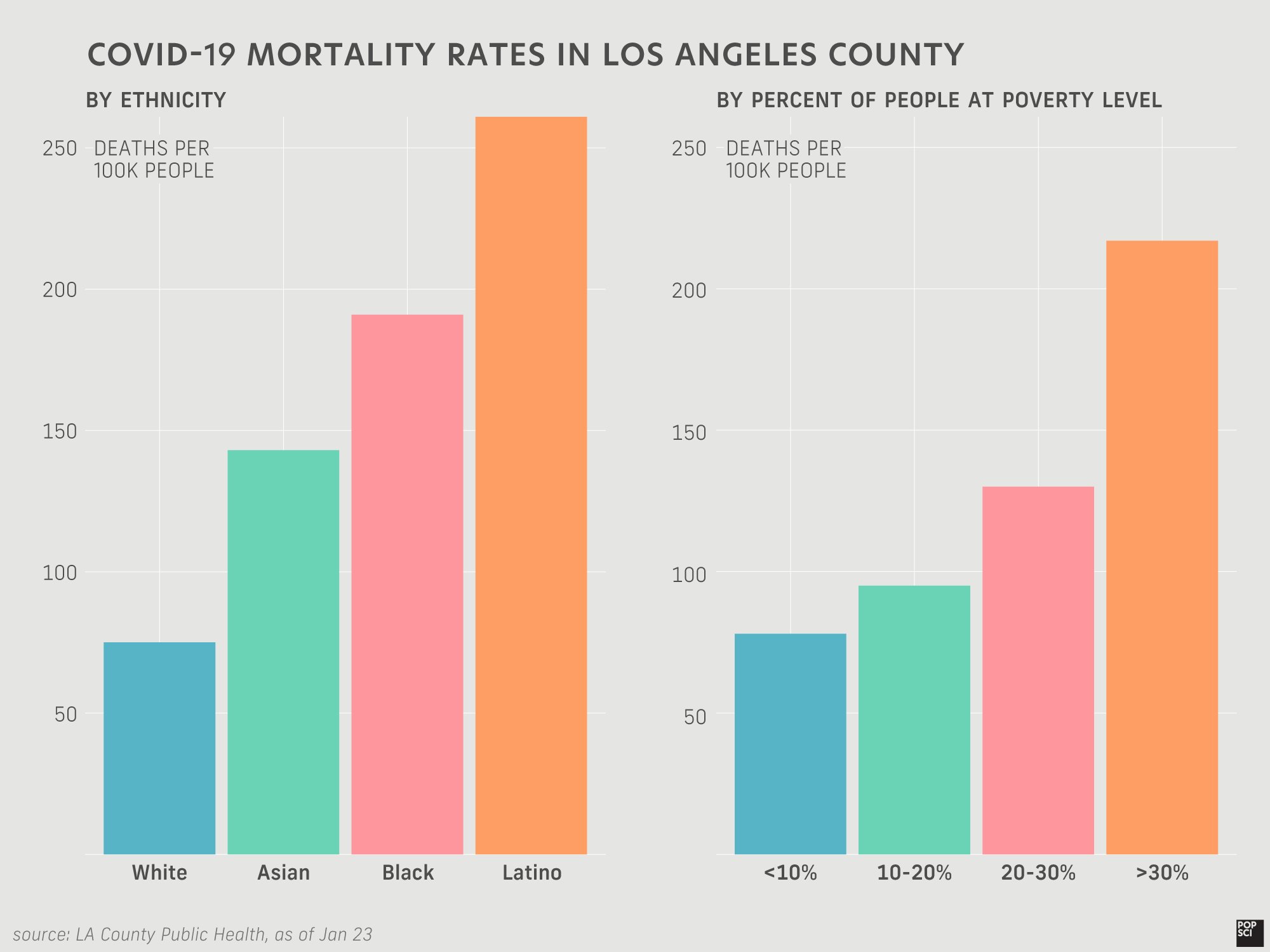
And it’s precisely those communities that have suffered the most.
The Latino community has by far the highest mortality rate, followed by Black and Asian folks. White people have the lowest by quite a bit. There’s a similarly predictable pattern with socioeconomic status. The poorer you are in America, the more likely you are to die of many causes, but the divide has rarely felt as stark as it has during the pandemic. As the graph above shows, areas of LA county with the highest poverty rates also have the highest mortality rates—and by a long shot.
But amid the dismal numbers and crowded hospitals, there is one more nuanced point that it’s important to make.
Though it’s difficult to tell from the endless charts and maps tracking COVID-19 cases and deaths, it’s actually quite challenging to directly compare how any given state (much less country) is faring against this virus because of significant differences in testing capabilities and policies. Stacking numbers from a state that’s hardly testing at all versus one with a robust testing network isn’t useful, simply because the more you test, the more cases you can expect to find.
All states have ramped up their testing from the early days of the pandemic, but not necessarily at the same rate.

California ranks at the top for total tests, which makes sense because it’s the most populous state. It’s somewhere near the middle of the pack when it comes to tests per 100,000 people, but you can see a steep incline over the past few months. That means that, even if actual infection rates had stayed exactly the same over that time period, you’d expect to be finding cases at a higher rate just by testing more.
That’s why some experts have turned in part to a statistic called the positivity rate, or the percent of COVID-19 tests that come back positive. If the number of actual cases stays flat and you test more, you would expect the positivity rate to decrease essentially because the denominator is getting bigger. If cases are increasing at the same rate as your testing capabilities, the positivity rate would stay relatively flat. A rising positivity rate (assuming that testing hasn’t decreased) is a clear sign that cases are rising dramatically.
As the Coronavirus Resource Center at Johns Hopkins University has shown, California’s positivity rate has been decreasing over the past few months after having risen during the fall. This hasn’t been the highest positivity rate the state has seen, but it is the highest its been while having a substantial testing regimen (the very early months saw high positivity, but also comparatively very few tests that may have been focused on people who were likely to test positive, like healthcare workers).
That trend needs to continue. One million statewide cases to date—or even the 25 million the US has nationally—will be nothing if people continue to be lax about preventative measures. The promise of a vaccine can’t make us complacent.
Note: This story has been updated to provide information on LA County lifting COVID-related restrictions.