
You can look at AIDS and HIV statistics as numbers in a table, but that doesn’t quite tell the story of how one of the deadliest diseases of our time spreads. Here in the United States, infection rates are intimately tied to race, education, geography, and more.
So reveals a new interactive map from researchers at Emory University and the data-mappers MapLarge. Three years ago, they teamed up to create AIDSVu, an incredibly granular look at HIV and AIDS diagnoses, updated yearly based on data from the Centers for Disease Control and local health agencies. Today they released an even more detailed version, which gives a sense of HIV and AIDS infection rates in the U.S. (and the context behind them) better than digits possibly could.

The darker the colors you see here, the higher the rate of AIDS and HIV diagnoses in that county. The lightest tan color you see (in Northwest Montana, for example) on the maps indicate a rate between 0 and 40 per 100,000 people, while the deepest reds indicate a rate of 384 or more diagnoses per 100,000 people (parts of Florida and the South). The white areas contain rates not shown because the population is too small or the diagnosis rate too low to get accurate stats while still protecting privacy. The gray states, only North and South Dakota in this case, had rates so low and a population so sparse they held their data back entirely, says Patrick Sullivan, an Emory University epidemiologist who worked on gathering the data and organizing the maps.
But the most revealing feature of the AIDSVu map is the option to do a side-by-side comparison of diagnosis rates with other statistics, like race, poverty, and education. The idea is to discover “what new kinds of data should we be putting up, how can we combine them, mash them up in ways that would be impactful,” Sullivan says.
Isolating the map for only African Americans is just one jarring view to come out of those side-by-side comparisons. There’s a trend similar to the overall rates map, but the rates are even more sharply divided into certain regions of the country.

One the most depressing national statistics is the rate of people with health insurance compared with HIV/ AIDS diagnoses. The map on the right shows the percentage of people with health insurance, by county. The darker the red, the higher the percentage of people with health insurance. You can see it’s pretty close to an inversion of the diagnoses map–meaning the people most likely to face a diagnosis are often the ones left without health insurance.

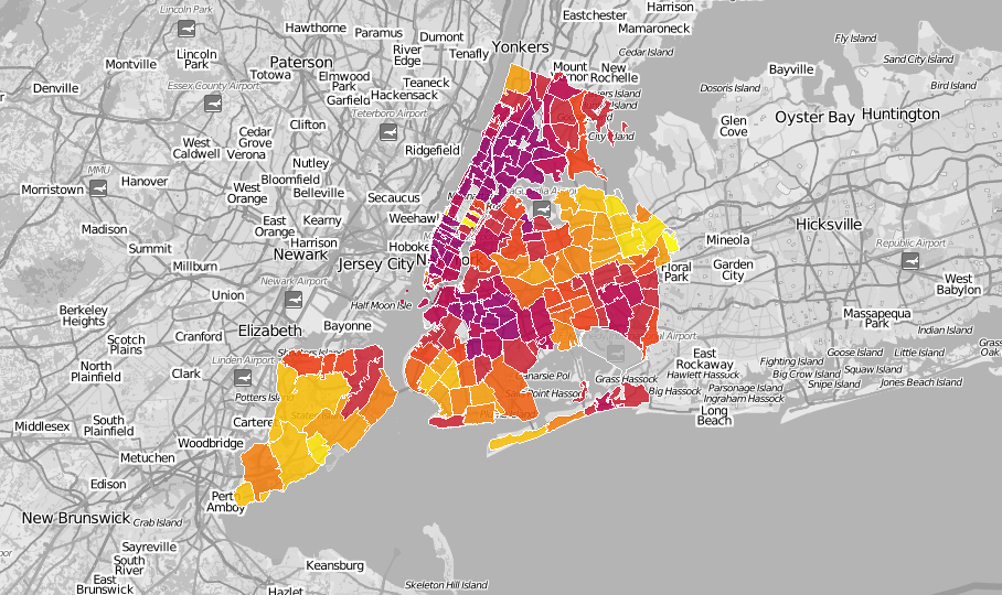
The map also lets you focus on individual cities. Here, for example, is New York City, which shows a dense rate of cases in Manhattan, lowering slightly into the outer boroughs.
Compare that to poverty rates in NYC, and you’ll see some major overlap.

Compare the diagnosis rates in Los Angeles to the the median income (the darker the green, the higher the income) and you see the same trend.


That’s the case for most of the country: more urban, densely populated areas are generally more affected by HIV and AIDS. (The map doesn’t offer reasons for this, but it’s a confluence of factors, like access to testing and treatment, Sullivan says.) But in the South, the rates have reached out to rural areas as well. Head even closer to the equator, to the very tip of Florida, and the map actually falls short of visualizing the severity of the disease. The region is dark red, meaning it has a rate of 384 or more diagnoses per 100,000 people. But some counties here have reached a rate of considerably more than 1,000 diagnoses per 100,000 people.

Sullivan says the hope is for both individuals and organizations to use the map as a resource. Individuals can search for the nearest testing center (and filter for more options) using the map. Health organizations can use the map to determine where the disease has hit hardest, and use that info to channel finite resources for the most effect. It could be working: Sullivan says organizations have used it to set up telemedicine systems in areas of Alabama where there’s just one infectious disease doctor or HIV specialist per 70,000 people.
You can check out the map here, and in honor of National HIV Testing Day, find a place to get yourself tested.
