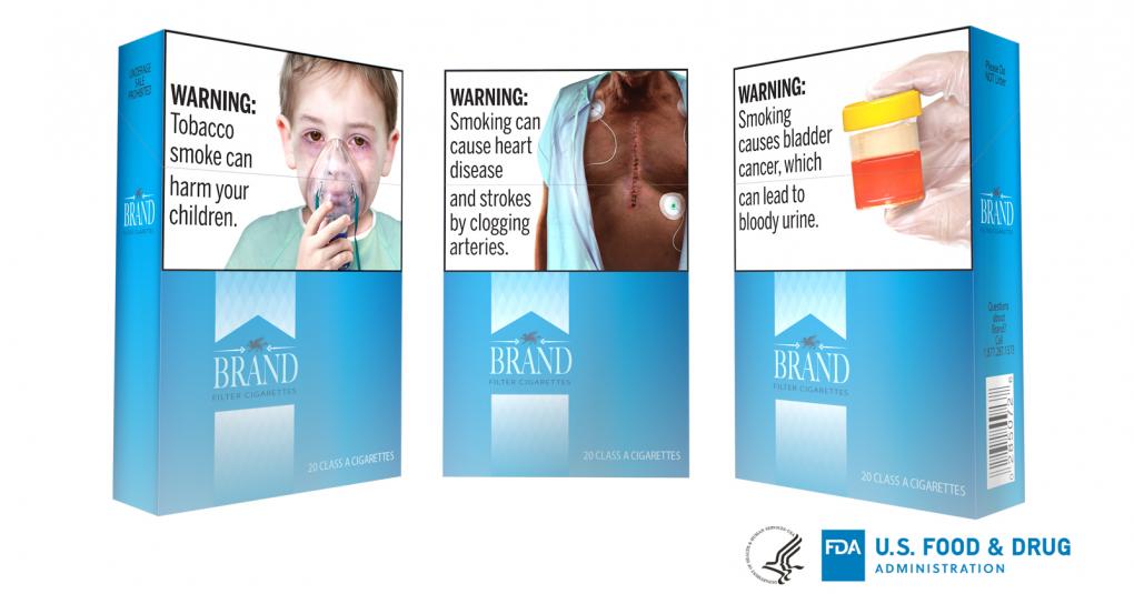

An image of bloody urine isn’t exactly cool. It’s not the kind of thing you’d want to see on your smoke break, right when you’re supposed to be doing something you enjoy. And that’s exactly why the Food and Drug Administration wants to put pictures of it—along with images of heart surgery scars and kids emaciated by secondhand smoke—on cigarette cartons.
The FDA proposed these new warnings this week, a full decade after they were originally directed to create new regulations for cigarette packages by the Tobacco Control Act. They actually did come up with those rules back in 2011, but several tobacco companies weren’t so keen on these graphic labels. So they decided to take the FDA to court, claiming there was no evidence that the change in labeling would influence a person’s decision to smoke, and thus that the FDA was infringing on First Amendment rights. And the U.S. Court of Appeals in D.C. agreed with them.
It might surprise you to learn, then, that the research back then was as clear as it is today: graphic cigarette warnings work. By the time the U.S. had decided to start implementing these types of labels, Canada was already far enough past its implementation date that researchers had begun studying the effects of these pictorial anti-smoking efforts. And they were working, if modestly. A 2013 study found that graphic warnings decreased the odds of being a smoker by 13 percent and increased the odds of a smoker attempting to quit by 33 percent. Generally speaking, the more a smoker thinks about or considers the warning, the more effective the label is. There’s even evidence, this time from the U.S., that the emotional response you get from looking at a graphic label reduces your neurological enjoyment of smoking.

Canada was the first to use these types of warning labels, but since then at least 40 other countries have joined in. It’s been difficult to study just how effective they are at changing smoking behavior, but the accumulated body of evidence, including studies from Canada, the U.S., and several European countries suggests they’re at least better than the old text-only versions. One study looking across the European Union also found that quitting rates went up by about 30 percent, consistent with what the Canadian report found.
Several of these studies also suggest implementing a plan to regularly update the warning labels. We all become somewhat blind to things we see repeatedly, so even graphic images have the potential to become so commonplace that they cease to be effective—we’d need to vary them over time for them to keep working.
It is true that the effect size from these warnings isn’t likely to be huge. None of the studies done in other countries shows a massive shift due to warning labels alone, and no one is expecting that to happen in America. The point is not so much that these graphic images will solve the smoking problem—it’s that they’re a step in the right direction.
Despite what the courts said and what tobacco companies would like you to believe, staring at a blackened lung while you step out for a smoke could actually help you quit. And seeing rows of bloody urine pictures at the drug store might keep some kids from thinking that smoking would be cool. Even a small dent in the smoking rate would make that worth it, and the evidence suggests these graphic warnings really would make a difference. A 2016 report from the Annenberg Public Policy Center on the issue noted that “contrary to the ruling of the D.C. court, research by APPC has found that evoking emotion that is supportive of the risks detailed in the warning text may be essential to making the warning labels more memorable and effective.” The APPC had actually already been researching this issue in an effort to encourage the U.S. to implement the same warnings Canada had begun using, and their studies were as clear then as they are now: graphic labels work.
