Facebook is a many-headed social hydra. There’s the original platform, built around the newsfeed; numerous acquisitions, from the photo-sharing platform Instagram to the international communication company Whatsapp; and spinoffs like Messenger, which is available within the Facebook mainframe and as a standalone app. The company has been accused of sending spam notifications on its main site, cluttering once-beloved apps like Instagram with unwanted new features, and intentionally designing all of its apps to monopolize our attention. But it announced Tuesday that Messenger is about to get simpler.
Instead of introducing tons of new features or crowding every page with features and graphics, the fourth iteration of Messenger is stripped down to the most essential functions. Yes, there are new color gradients for message bubbles, the usual supply of infinite gifs and stickers, and a tweak to the logo. But users will also see a serious Marie Kondo-ing (author of the bestseller The Life-Changing Magic of Tidying Up), as Messenger bucks the busyness trend and reduces its existing nine tabs to just three—chats, people, and discover.
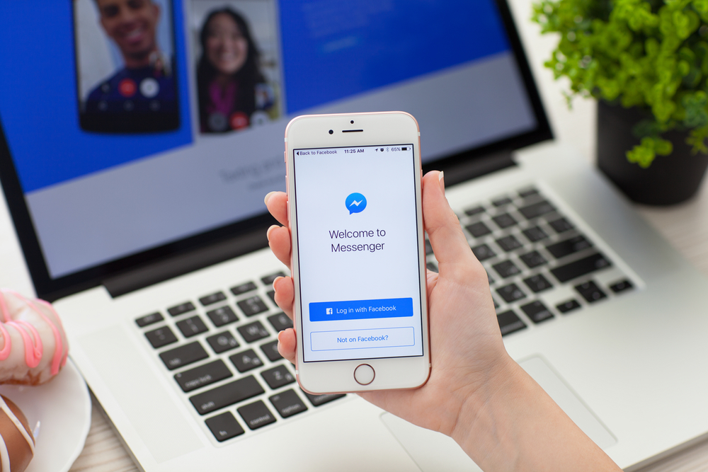
The origins of Messenger trace back more than a decade, to Facebook Chat, which debuted in 2008. Nested within the larger social network, it functioned as a sort of an instant messaging service—a slightly sleeker AIM. In 2011, the chat service was rolled out as a standalone app for iOS and Android phones. Today, Messenger supports text-based notes and photos, voice calls and video chats, and even gaming. It can be used by with or without a Facebook account. According to its parent company, 1.3 billion people now use the communication service each month.
As Messenger’s usership has grown, so too has its built-in features. The app now includes a Venmo-like ability to send money directly through the app, and new ways to decorate messages like stickers and emojis, all of which are designed to appeal to customers on most continents. But some argued the continuous growth made the platform unwieldy, crowded, or uninviting—three things an attention-based service never wants to be. So Messenger decided to get back to basics.

Decluttering an app seems easy: just toss out the features you don’t like and utilize the rest. But simplifying the platform took roughly two years and the expertise of user interface designers, researchers with a keen eye for human behavior, and test users from eight countries to get right.
“Together with our research team, Messenger designers travel often to see how the app is used by people everywhere,” Loredana Crisan, Messenger’s product design director, told PopSci over email. Many communication preferences seem universal, she says. Seven in 10 people report that the app’s ease of use was its most important feature—a stat that emboldened the design team as they set about streamlining the app.
Researchers also found that the little draft button in the upper-right-hand corner wasn’t as important as they thought, according to Messenger’s head of product Stan Chudnovsky. Instead of starting a conversation from scratch, most users found the friend they wanted to message by scrolling through recent conversations. That’s why the relaunched Chat tab has been cleaned up and offers more chats at first glance; you can six recent messages visible in Facebook’s press rendering, compared to just four in the previous version.
Other message preferences seem to be shaped by regional culture, presenting a challenge to the designers of an app with global demand. “[I]n some countries, like Romania, my home-country, people spend a lot of time connected on voice calls, while in the [United States] text chat is more common,” Crisan writes. “Another difference we see often is around visual messaging: in Asia, stickers are very popular while in other regions people prefer gifs or emoji.” The result is that Messenger’s main page is standardized around three fundamental needs, but offers endless customization within each chat, where users can still find sticker sets, add nicknames, or assign conversations colors and emojis.
In addition to the glitz and glam, the retooled Messenger app will also have a few new functional services. The Chat and People tabs connect you to your friends and family, but Discover will connect users to businesses, encouraging them to message restaurants or stores for reservations or information about what’s in stock. The much-hyped group video chat, which can accommodate as many as 50 people, is available. And practical features like bill splitting and polling have also arrived.
Even with years of development and lots of pre-launch testing under the belt, the design team is anxiously awaiting public feedback on the redesign. “The biggest challenge is the risk of breaking the experience for them, since change is almost always unwelcome at the start,” Crisan wrote. Fewer tabs should make the app easier to navigate. And designers took pains to improve contrast on the page and make the user interface easier to read. “But right at the beginning it can feel disorienting, like someone came in and moved all your furniture around without asking you first.”
Fortunately, when compared to the sensory overload seen on its sister apps, Messenger’s realignment feels rather zen.