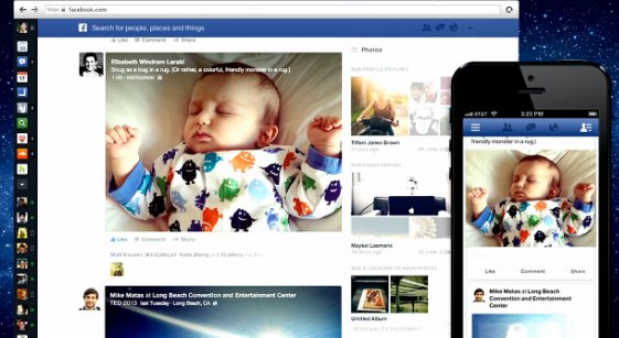
At an event this morning, Facebook took the wraps off the service’s latest design. The idea is, as Facebook says, to “pull back the chrome,” simplifying the way the site works and looks. That means cutting down on all the boxes and lines and shading and sidebars and lord knows what else litters your homescreen right now. It’s more like a mobile app than ever before; just the stream of news.
And it actually is similar to a news site in a few ways; it now has different sections, so you can check out what your friends have been doing in specific categories like music, photos, and games. They’re all kind of individual feeds, which is clever; services like Instagram (which Facebook owns), plus Vine and Twitter, are much more concise, and this is a way for Facebook to not be quite so bulky.

And it looks great! Facebook has not always been the nicest-looking service, but the cleaner design, paired with larger images and videos, make it perhaps the most aesthetically appealing version of Facebook yet. Of course, big photos also mean big ads, which could be irritating.
Facebook’s new design will begin rolling out today, though not all at once.
