Most fonts are designed for ease of use. Lora, which you’re reading right now, was chosen by the PopSci web team because it’s easy to read, and also free. Reviled for its “childish” look, Comic Sans is nonetheless considered one of the easiest fonts for dyslexics to read. Word processing darlings, from the sleek Arial to the nostalgic Times New Roman, strive to be similarly practical.
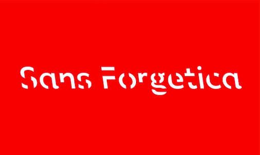
It was unusual, then, when researchers at RMIT University in Melbourne, Australia approached typography professor Stephen Banham about crafting a font that was harder to read. “[It] was unlike any other typeface I have designed,” he wrote in an email. He broke each letter; the S looks like someone dragged an eraser down its midline, the G like a roughed-up zebra, the W like a broken dinner plate. And he tilted each letter—and with it, therefore each word or line or paragraph—on an axis, setting the misfit runes deliberately askew.
Banham’s goal, however, wasn’t to confuse. Quite the opposite. In breaking the fundamental rules of typography, Banham and his colleagues say they’ve found a simple way to improve a reader’s memory. That’s why they named their font, released this month and available for free download online, Sans Forgetica.
Learning can feel a bit like Goldilocks pursuing the optimal porridge. When things are too hard, says Carnegie Mellon University psychologist Daniel Oppenheimer, people feel inclined to quit. (If mastery is so clearly out of reach, why even bother?) But when the tasks at hand are too easy, people end up bored. In psychology, “just right” is called “desirable difficulty.”
Once you have the words for it, desirable difficulty appears far outside the bounds of the classroom. Roundabouts, for example, have been shown to improve street safety, because they require drivers to think harder about their decisions than a four-way stop might necessitate. And while they’re best known for ushering in an unprecedented, app-based era of convenience, user experience designers will selectively make things more difficult (or, in the professional parlance, “disfluent”) to ensure they have the user’s attention.
Designers and psychologists have been theorizing ways to manipulate fonts to improve recall for years. Oppenheimer, who is not a part of the Sans Forgetica project, did some of the earliest research on this idea. In 2011, his team published what was effectively a proof of concept. It showed, across two different testing environments, that participants were better able to recall a passage of text when it was printed in a more comprehensible font. Other papers, including a 2012 study on disfluency in typography cited heavily by the Sans Forgetica team, emerged in the intervening years.
But the Sans Forgetica project is fundamentally different. Banham and his collaborators weren’t just gathering more data, they were refining a new—and very usable—memory-boosting font of their own.
“We designed three different fonts that each consecutively broke more design principles,” writes Janneke Blijlevens, one of the Sans Forgetica researchers and an expert in consumer design. “The first font only had gaps, breaking the principle of closure. The second font had gaps and had a backslant… The third had gaps, a backslant, and was asymmetrical. We found that the second broke just enough design principles to be desirably difficult; this then became what is now known as Sans Forgetica.”
Early research has hinted at Sans Forgetica’s promise. Research papers have yet to be published, but The Guardian reports that recall was 7 percent higher with Sans Forgetica than Arial, rising from 50 to 57 percent. But many questions remain unanswered.
For one, researchers aren’t yet sure how universal “desirable difficulty” really is. What may be perfect challenge for one individual could easily stymie another. Since publishing his own research on memory and fonts in 2011, Oppenheimer says, “there have been several replications of the finding, and several people who have not found the finding.” The results seem to differ with the study population. Whether Sans Forgetica has overcome this challenge can only be determined with widespread use.
Similarly, what’s challenging today may not be challenging tomorrow. “As people become more used to Sans Forgetica it may become less desirably difficult,” writes Joanne Laban, who worked on the project.
Still, Oppenheimer believes there’s reason to remain optimistic. “I always thought with our original study that there were really great opportunities for intervention,” he says. Plus, if it works, “it’s basically cost-free.”
