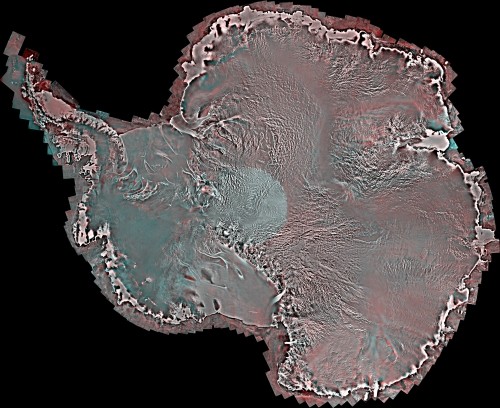

A newly released image of Antarctica offers the most complete, detailed view of the continent since 1997. The map is a mosaic of more than 3,150 individual, high-resolution readings, taken in the Southern Hemisphere’s autumn of 2008, and tiled together into a coast-to-coast view of the entire continent with its coastal waters. And the results sure are pretty.
Scientists will compare the two images to learn more about changing Antarctic ice conditions, says Ellsworth LeDrew, director of the Canadian Cryospheric Information Network and a professor at University of Waterloo.
The information is being made free of charge to the public online, via the Polar Data Catalogue. “It used to be that a lot of data were inaccessible” to non-specialists, says Ellsworth. Now anyone will be able to find and use the maps to better understand science, environmental issues and political policies affecting Antarctica. The data from 1997 will also be put online in the same collection, hopefully “in the next few months,” he says. Furthermore, the Polar Data Catalogue will allow users to search for the individual tile images of particular Antarctic locations, making the data easier to store and use.
The different colors on the image represent different wavelengths and frequencies of light. “These colors in a nutshell represent different physical characteristics of the ice, which the scientist can interpret,” LeDrew says. “It’s what is called polarimetric information. It’s like looking through a camera’s polarizing filter. Some wavelengths are up and down and some are side to side. These colors represent these wavelengths and different wave bands,” which to an informed eye will reveal much about the condition and motion of glaciers, ice shelves and sea ice. “For example where the edge of a glacier is, or sea ice shelves that have broken off,” he says, or ice thinning as landbound glaciers expand towards the sea. Ships also use the information for navigation, he says.
“Also, you will be able to access subareas – the individual images that are stitched together – at very high resolution. You don’t have to pick out the entire mosaic,” says LeDrew, to study the edge of a particular glacier or where certain sea ice shelves have broken off since the late 1990s. “This is very important for looking at changes in the environment over time.”
LeDrew spoke with Popular Science just a few hours before leaving for New Zealand, where he will present this new image at the 2014 Open Science Conference of the Scientific Committee on Antarctic Research.
