
This story was originally published by Grist. Sign up for Grist’s weekly newsletter here.
If you’ve been wondering what climate change means for your neighborhood, you’re in luck. The most detailed interactive map yet of the United States’ vulnerability to dangers such as fire, flooding, and pollution was released on Monday by the Environmental Defense Fund and Texas A&M University.
The fine-grained analysis spans more than 70,000 census tracts, which roughly resemble neighborhoods, mapping out environmental risks alongside factors that make it harder for people to deal with hazards. Clicking on a report for a census tract yields details on heat, wildfire smoke, and drought, in addition to what drives vulnerability to extreme weather, such as income levels and access to health care and transportation.
The “Climate Vulnerability Index” tool is intended to help communities secure funding from the bipartisan infrastructure law and the Inflation Reduction Act, the landmark climate law President Joe Biden signed last summer. An executive order from Biden’s early months in office promised that “disadvantaged communities” would receive at least 40 percent of the federal investments in climate and clean energy programs. As a result of the infrastructure law signed in 2021, more than $1 billion has gone toward replacing lead pipes and more than $2 billion has been spent on updating the electric grid to be more reliable.
“The Biden Administration has made a historic level of funding available to build toward climate justice and equity, but the right investments need to flow to the right places for the biggest impact,” Grace Tee Lewis, a health scientist at the Environmental Defense Fund, said in a statement.
According to the data, all 10 of the country’s most vulnerable counties are in the South, many along the Gulf Coast, where there are high rates of poverty and health problems. Half are in Louisiana, which faces dangers from flooding, hurricanes, and industrial pollution. St. John the Baptist Parish, just up the Mississippi River from New Orleans, ranks as the most vulnerable county, a result of costly floods, poor child and maternal health, a list of toxic air pollutants, and the highest rate of disaster-related deaths in Louisiana.
“We know that our community is not prepared at all for emergencies, the federal government is not prepared, the local parish is not prepared,” Jo Banner, a community activist in St. John the Baptist, told Capital B News.
Even in cities where climate risk is comparatively low, like Seattle, the data shows a sharp divide. North Seattle is relatively insulated from environmental dangers, whereas South Seattle — home to a more racially diverse population, the result of a history of housing covenants that excluded people on the basis of race or ethnicity — suffers from air pollution, flood risk, and poorer infrastructure.
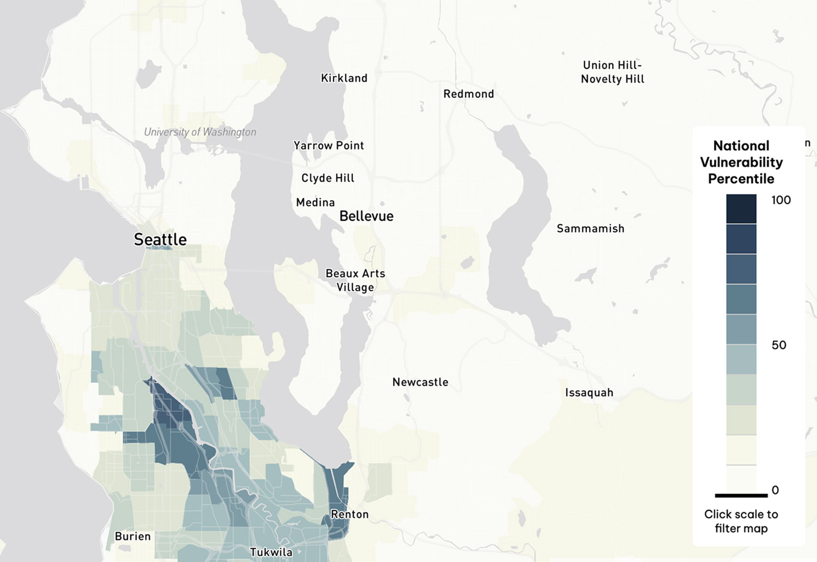
The U.S. Climate Vulnerability Index; Mapbox / OpenStreetMap
Similar maps of local climate impacts have been released before, including by the Environmental Protection Agency and the White House Council on Environmental Quality, but the new tool is considered the most comprehensive assessment to date. While it includes Alaska and Hawai‘i, it doesn’t cover U.S. territories like Puerto Rico or Guam. The map is available here, and tutorials on how to use the tool, for general interest or for community advocates, are here.
This article originally appeared in Grist at https://grist.org/extreme-weather/new-map-climate-change-risks-neighborhood-vulnerability-index/. Grist is a nonprofit, independent media organization dedicated to telling stories of climate solutions and a just future. Learn more at Grist.org
