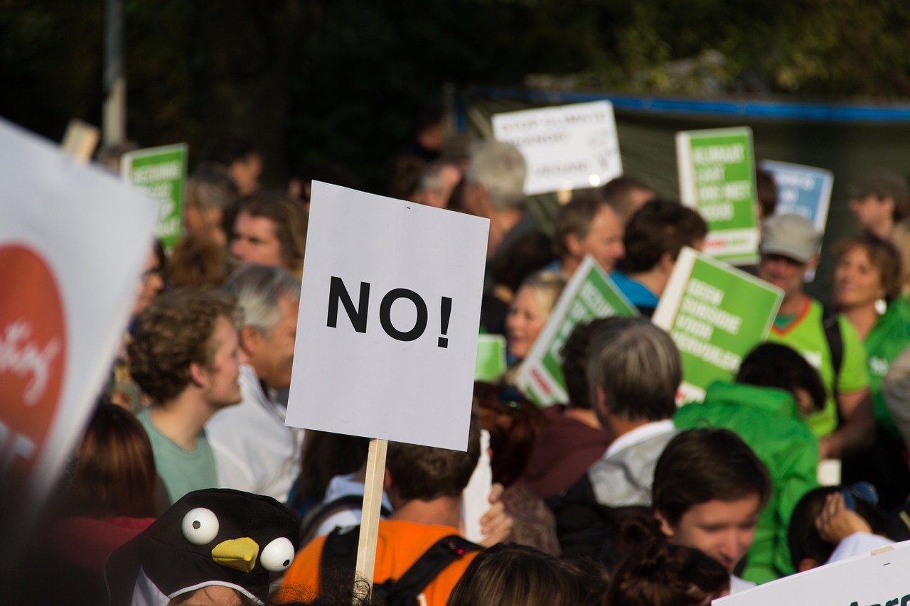
On April 22, scientists, science-lovers, and at least one official Science Guy will be gathering in Washington, D.C. for the March for Science. A week later, on April 29, the People’s Climate Movement will march in favor of action against climate change. If you plan to attend either event, you’ll want to voice your support for science. And that means designing the perfect sign.
Bigger is better, of course. Bold letters and ample surface area are key. Then there’s carrying it. At marches in DC, sticks are forbidden for safety reasons, which means science fans will need to get creative with their poster grips.
To help you plan, Popular Science spoke with Michele Demsky, an exec at poster company ArtSkills, about how to stock up on materials and plan out the perfect sign—and what to do with it when your arms (inevitably) get tired.
Choose your board wisely
Most people make their signs from either poster board or foamcore. Each option has its pros and cons, so your choice will really depend on personal preferences.
Poster board is cheaper, and you can roll it up to transport it more easily, although this may give the board a curve so it’s less likely to stay flat when you want it to. That roll-ability also means it’s more prone to flopping over. To bolster the less sturdy material, you can glue or tape flat wooden paint stirrers to the corners.
Foamcore is more expensive, but it’s also sturdier and more weather-resistant. “Foam board is stiff,” Demsky says, “and it’s so light you can hold it with your pinky.” A foam sign will stay upright more easily, and you can even add a three-dimensional attachment—say, a Styrofoam model of the Earth—without the edges flopping over. Because of this stiffness, however, it can be awkward to transport from place to place.
Can you handle this?
Once you’ve picked a material, you’ve got to figure out a way to carry it. “If you have a type of handle, it’s easier to hold onto,” says Demsky.
One solution is a product called an easel back, a self-sticking cardboard attachment you can press to poster boards to make them stand up on a surface. For our purposes, you can attach two easel backs to the back of your sign where you’ll want to hold it, fold them open, and trim the cardboard to make it comfortably fit your hands.
You can also attach two small, light rods to the bottom of your poster and hold them. Paint stirrers, for example, are available for free at hardware stores, and even a pair of cardboard paper towel tubes can support the weight of poster board or foamcore.

If you’d prefer to avoid attaching objects to your sign, then you should probably choose a foamcore base. It’s sturdy enough that you can cut out your own handles in the sides, the bottom, or both.
No matter which handles you use, holding up even the lightest sign for hours will tire out your arms. So you’ll want a plan B.
“Get some string, cut two holes in the top of your posterboard, and hang it around your neck,” Demsky says. “It’s the easiest way of taking a break.” You can even create a sandwich board by hanging one sign from your front and another from your back.
Get spacey
Your message won’t do much good if people can’t see it. “In order to get noticed, you have to plan,” Demsky says.
First, sketch out your words in pencil, using a ruler to keep your lines straight and ensure even spacing. Make sure that everything fits and is centered before you follow up with marker or paint. You can also play around with size and framing.

“What is it you want to say?” Demsky asks. “Make sure that word speaks loudly; it’s got to be the biggest. Framing something helps your eye land in the center.”
To make your words visible from a distance, letters should be large and boldly marked. If you’re working up close to the sign, say at a kitchen table, visibility can be difficult to determine. You may want to stand back some distance and see if your message will still be easily readable.
For maximum effect, Demsky recommends using stencils, or drawing bubble letters and then filling them in. For the less artistically inclined, there are stick-on poster letters, demonstrated below.
Color me visible
When you choose your materials, make sure to take color into consideration. “White and black is good contrast,” says Demsky, “but if you can get a rainbow or hot pink poster board, when you have a bright color, the eye normally will go to that.”
Bright colors, shimmering or glittering materials, even poster lights can draw more attention to your sign. But if the colors of your letters don’t contrast with the color of your board, your words will be harder to see. For example, using rainbow colors for your letters might be eye-catching, but if one of those colors is yellow, it will disappear against a white poster.

If the words are your biggest priority, go with black letters on a white poster (or white letters on a black poster). This combination will create the most legible message. To spruce up your sign, try black letters on a bright backdrop, or bright letters on a white background.
“If you’re using a rainbow board or a bright neon, black is your best bet for letters,” says Demsky. “Holographic neon letters look great on a white poster.” These options maintain a contrast between letters and board, which should make them legible—even if they’re not as stark as black-on-white.
But what to write? We’ll leave that up to you.
