Climate scientists have long been saying that a few degrees of temperature change could mean a heck of a lot for the global climate. That warning has become even louder since the release of the most recent IPCC report last month, with evidence that retreating glaciers, dangerous heat waves, and other disasters are becoming more inevitable. Of course, there’s still time to avoid the worst climate change impacts—but for many people, the fight needs to get a bit more personal.
Thankfully, the IPCC has an answer to that as well. The AR6 Working Group I Interactive Atlas, officially released earlier this week, allows anyone with internet access to dig through troves of stats and projections to look at the present, past, and future of climate change.
At first glance, the high-tech map might seem overwhelming with dozens of variables, scenarios, and datasets. So, we’ve provided a little guide on what all the numbers, terms, and scenarios mean to make exploring the atlas easier for you.
Timelines
When you’re looking at the data going into the future, you’ve got three options of climate models: CMIP6, CMIP5, and CORDEX. The Coupled Model Intercomparison Projects, aka CMIPs, take a global look at distinct climate models. According to Carbon Brief, CMIP6, which was just released this year, has a better exploration of a “business as usual” model and higher climate sensitivity than CMIP5, which is from 2013.
Meanwhile, CORDEX, or Coordinated Regional Climate Downscaling Experiment, looks at smaller regions of the world and forecasts their climate futures. If you’re just interested in looking at how the Arctic will fare, for example, this may be the choice for you. Both CMIP and CORDEX datasets allow you to spy into history as well—looking at chunks of time between the 1980s and today.
[Related: An ancient era of global warming could hint at our scorching future]
Another dataset to dive into is “observations,” meaning what scientists have actually been able to see over time. There are two different periods to choose from for this: 1961 (around the time the Keeling curve was created) through 2015 and 1980 (about when climate change first made national news) through 2015.
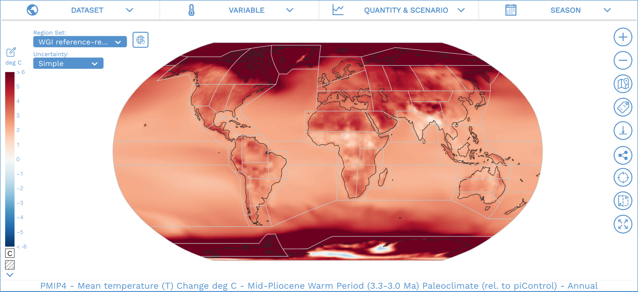
Finally, you can go even further back in history with a fourth data set of projections: the Paleoclimate Modelling Intercomparison Project, or PMIP, which covers paleoclimate. So if you want to see what was going on in the last glacial maximum 20,000 years ago or the Pleiocene 3 million years ago, there’s something for you, too.
Variables
As you’ve probably heard by now, global warming is going to affect pretty much everyone on Earth. The amount of change is variable, but in the atlas, you can see that maximum, mean, and minimum temperatures on the Earth’s surface will rise in pretty much any case. You can also explore precipitation, snow, and wind levels to see how seasonal factors might hurt your corner of the world.
It’s also no secret that climate change is impacting, and will continue to impact, the oceans. You can watch surface pH levels and sea ice concentrations drop in the future (of course, varying on how fast warming happens) and track temperatures as they creep up. Additionally, you can explore different scenarios based on human behavioral predictions and patterns, like anthropogenic carbon emissions and population density, as they change with the climate.

Quantity and scenario
This section can be a little confusing, but the best way to decode it is to remember what the climate pathways mean. The factors are more or less a result of how people, nations, and industries conduct themselves in the coming years. The four Shared Socioeconomic Pathways or SSPs that the IPCC used in their atlas are the CMIP6 counterpart of CMIP5 RSPs and CORDEX RCPs. Here’s what they all mean.
SSP1-2.6
This is the most optimistic look at our future, where we severely chomp down on CO2 emissions and reach net-zero soon after 2050. However, this method sets a threshold of a 1.8 degree Celsius increase by the end of the century, so even in this situation, we would have failed to meet Paris Agreement goals.
SSP2-4.5
Here we reach net-zero emissions by 2100 and sustainability progress is a slow-moving machine. By the end of the century, the climate will peak at about 2.7 degrees Celsius higher than pre-industrial levels, which is, frankly, a bit frightening.
[Related: There’s only one country doing its Paris Agreement homework.]
SSP3-7.0
This is closest to the business-as-usual level: Emissions end up doubling, the current economy is as competitive as ever, and by the turn of the century, there’s a 3.6 degrees Celsius jump.
SSP5-8.5
This edition is more or less a worst-case scenario that would have emissions doubling in the next 30 years and a 4.4 degrees Celsius leap by the end of the century, resulting in extreme heat, sea-level rise, and other deadly conditions.
Seasons
This one is more or less self-explanatory. If you want to check out what’s going on specifically during the spring, winter, fall, or summer around the planet, dig in here. Interestingly, you can also plug in your own customized season if say, you’re curious about Atlantic hurricane season or California wildfire season (both traditionally from June to November) or Asia’s monsoon season (between April and September).
Regional synthesis
Another cool feature in the IPCC atlas toolbox is the Regional Synthesis interaction. If you want to get a quick and clear summary of multiple local weather and climate impacts, this is for you. The categories include temperature, amount of precipitation, frequency of droughts, wind shifts, snow and ice changes, coastal impacts like erosion and flooding, and even pollution and surface radiation. You can only explore the feature for a swathe of the future—there are no specific dates or degrees.
This breakdown is especially interesting for comparing climate factors, like mean air temperature and extreme heat, that will be changing more or less across the board against ones that will be much more apparent locally. In the Mediterranean, for example, there’s a high chance that average annual rainfall will decrease in the future, whereas just a short plane ride away in northern Europe, rain is likely to increase. Both spots, however, are expected to experience hotter temperatures.
The future of the planet is still full of mysteries. But climate scientists have more insights than ever before—and now everyone else has access to them, too.
