

As of last year, there were something like 650 million active web sites on the Internet. That number is growing fast, but even if it weren’t–even if it stopped dead in its tracks right now–you could spend the next 50 years surfing the web at a pace of five sites per minute, 12 hours a day, 365 days per year, and you’d still only visit (briefly) 10% of the Internet Universe.
Unlike the actual Universe, however, the Internet’s places do not exist in physical space–there’s no such thing as one website being “close” or “far” from another one; the two are either linked or they are not.
While those links don’t correspond directly to any kind of distance or direction, they do suggest a relationship. If, for example, someone built a personal website, and linked to their website through their Facebook page, people would really only arrive at the website via the Facebook page. Most likely, that would mean that not too many people visited the website; the website would be a tiny little out-of-the-way place in the Universe of the Internet.
That’s pretty much the logic employed by the architects of this interactive map of the Internet Universe.
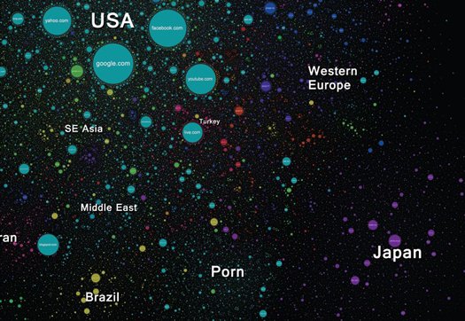
The circles on the map represent over 350,000 web sites from 196 countries around the world:
Every site is a circle on the map, and its size is determined by website traffic, the larger the amount of traffic, the bigger the circle. Users’ switching between websites forms links, and the stronger the link, the closer the websites tend to arrange themselves to each other.
If you’re already checking it out, you’ve probably noticed that those basic organizational rule gives rise to a few major patterns:
First, countries–represented in different colors–tend to form clusters, since people in any given country tend to move between their own country’s websites. Those clusters dominate regions of the internet universe: US websites abound in the middle in light blue, China occupies the mustard-colored region on the bottom left, Japan, in purple, dominates the bottom-right, and Russian websites, in red, are strewn across the top.
But you can also see how the popularity of a few websites and a couple topics disrupt the nation-based clustering. Indeed, the basic structure of the Internet Universe seems to be determined by the three biggest sites, Google, Facebook, and Youtube, which form a core at the center of the map, with countries radiating outward. (Interestingly, but perhaps not surprisingly, the Big Three do not appear to exert much gravity on China’s galaxy cluster, which sprawls out like a universe on its own.)
The most fascinating example of topical organization has to be the vast galactic cluster of porn near the bottom right, comprised (mostly) of U.S. websites, sandwiched between Japan and Brazil:
A few other points of interest:
1. Blogspot’s apparent popularity in Iran. Also, the way Iran is almost exclusively surrounded by China, South Korea, and Thailand
2. The way that so many of those weird sites that you can’t imagine anyone actually deciding to make lie huddled around popular social networking sites, sort of like little parasites.
3. The way that WordPress is super isolated and alone out on the fringes of the Universe. Why is that?
