Environment
Global Warming
The planet is heating up. Here's what that means for life on Earth—now and in the future—and what we can do to reverse the trend.
Latest in Global Warming

Environment
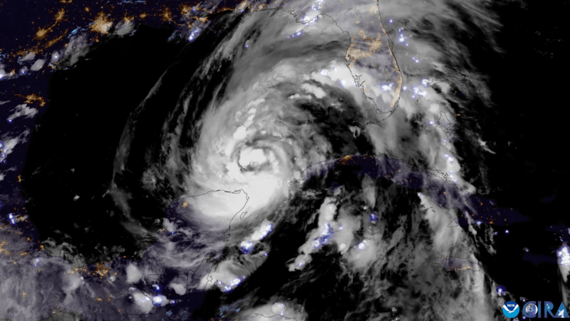
What Hurricane Helene looks like from space
Environment
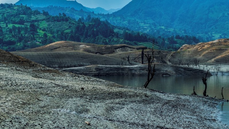
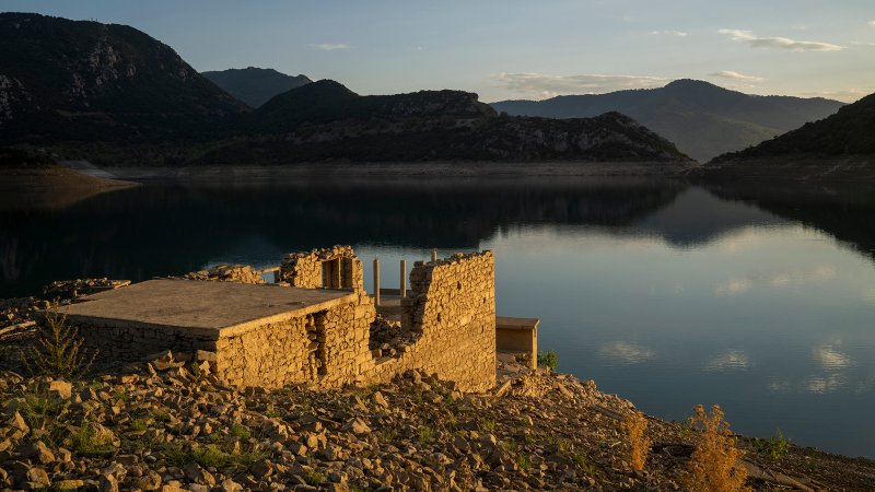
Drought reveals a sunken village in Greece
Climate Change
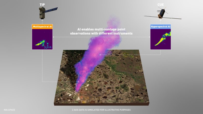
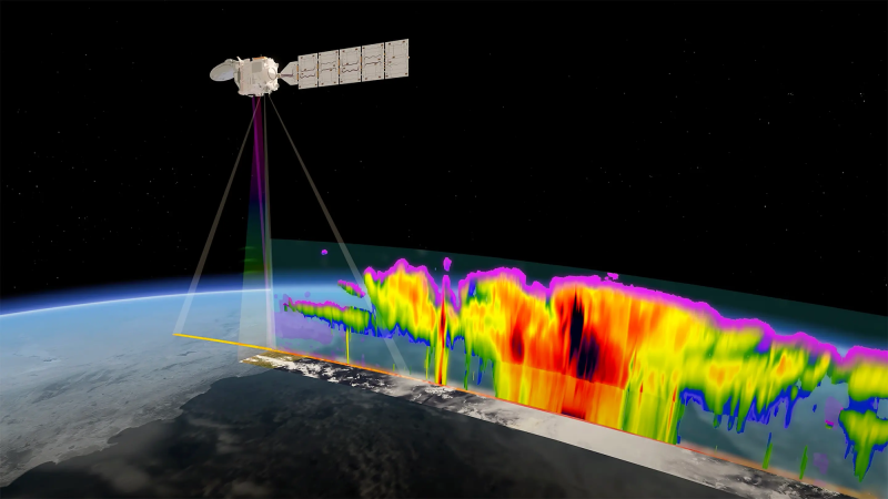
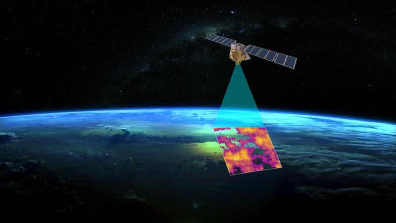
The ‘White Dragon’ satellite will keep watch over our clouds
Environment
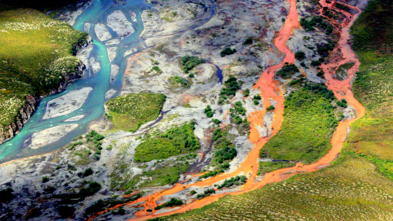
Why are Alaska’s rivers turning orange?


Environment
Stronger hurricanes may call for a ‘Category 6’
Environment
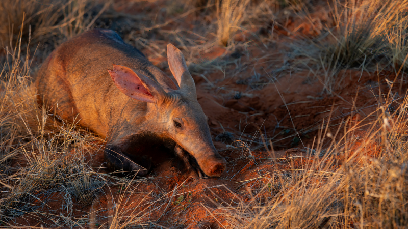
Why scientists are studying aardvarks’ poop

Environment