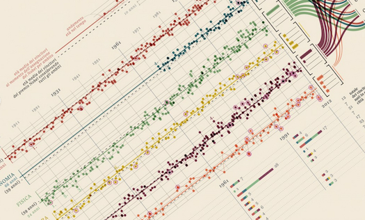

Courtesy of Italian design agency Accurat, here’s a simple, attractive look at data from the Nobel Prizes. It’s in Italian, but like most well-done infographics, it doesn’t require too much reading to get the idea. At a glance, you can tell prize-winners in economics are older than the average age for all categories, and winners in chemistry and physics are older than they were in the early 20th century. (By contrast, the age for peace prize winners looks more erratic. Take a look at those orange circles.) There’s also a look at winners by home city (New York takes the crown), and a space for university affiliation of the laureates. Check out a bigger version here.

by accurat. Check out our data visualization blog.
