9 Of The Most Amazing Infographics Of 2012
SHARE

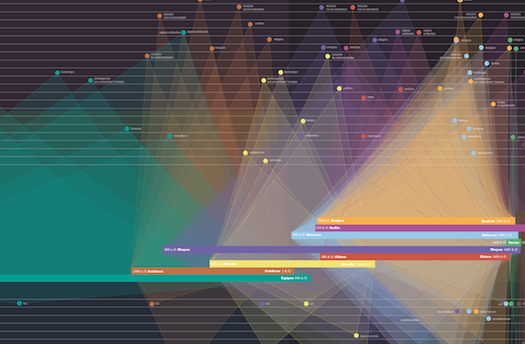
The design firm Information is Beautiful has announced winners of the inaugural Information Awards Inspired by Kantar competition. Prizes went to the most brilliant, most beautiful infographics, data visualizations and interactives of the year. Check out the photo gallery to see the winners!

A strikingly elegant guide to the year's full moons, by the same designer who brought us <a href="http://dmtr.org/timelapse/">this amazing timelapse.</a> <em>Award: Bronze, Data Visualization</em>

Lunar Calendar

A strikingly elegant guide to the year’s full moons, by the same designer who brought us this amazing timelapse. Award: Bronze, Data Visualization
Metallica's concert history, 1982-2012. <em>Award: Bronze, Data Journalism</em>

Metallica on Stage

Metallica’s concert history, 1982-2012. Award: Bronze, Data Journalism
Vacations to space, robot surgeons, weather control...designers at Envisioning Technology, a trend forecasting studio, chart the strange new world of the near future. Check out the interactive graphic <a href="http://visual.ly/envisioning-emerging-technology?view=true">here</a>. <em>Award: Silver, Infographic/Infodesign</em>

Envisioning Emerging Technology For 2012 And Beyond

Vacations to space, robot surgeons, weather control…designers at Envisioning Technology, a trend forecasting studio, chart the strange new world of the near future. Check out the interactive graphic here. Award: Silver, Infographic/Infodesign
Which bands and singer-songwriters have been covered the most? This infographic maps out the answer, from 1958 through 2010. Throughout the weaving timeline, the width of the colored ribbons represent the number of covers released by selected famous artists, and the singled-out song names throughout are the most-covered songs of their year. <em>Award: Gold, Infographic/Infodesign</em>

Cover Mania

Which bands and singer-songwriters have been covered the most? This infographic maps out the answer, from 1958 through 2010. Throughout the weaving timeline, the width of the colored ribbons represent the number of covers released by selected famous artists, and the singled-out song names throughout are the most-covered songs of their year. Award: Gold, Infographic/Infodesign
An <a href="http://notabilia.net/">interactive visualization</a> of deleted Wikipedia pages. <em>Award: Gold, Interactive Visualization</em>

Notabilia

An interactive visualization of deleted Wikipedia pages. Award: Gold, Interactive Visualization
CNN tracks the true cost of the U.S. war in Afghanistan with this <a href="http://www.cnn.com/SPECIALS/war.casualties/index.html">interactive map</a> showing the hometowns of North American soldiers, as well as the places they were killed. <em>Award: Gold, Data Journalism</em>

War Casualties, At Home And Abroad

CNN tracks the true cost of the U.S. war in Afghanistan with this interactive map showing the hometowns of North American soldiers, as well as the places they were killed. Award: Gold, Data Journalism
This <a href="http://awesome.good.is/transparency/web/1101/good-energy/interactive.html">interactive graphic</a> displays where America gets its energy, and where it all goes. <em>Award: Silver, Interactive Visualization</em>

The American Energy Spectrum

This interactive graphic displays where America gets its energy, and where it all goes. Award: Silver, Interactive Visualization
Government spending has never been as entertaining, or so well elucidated, as in <a href="http://www.guardian.co.uk/news/datablog/interactive/2011/oct/26/public-spending-uk-government-department">this interactive graphic</a> by the staff of <em>The Guardian</em>. _Award: Silver, Data Journalism

U.K. Government Spending

Government spending has never been as entertaining, or so well elucidated, as in this interactive graphic by the staff of The Guardian. _Award: Silver, Data Journalism
Should people be allowed to wear religious symbols while performing professional duties? A graphic designer in Denmark <a href="http://www.peterorntoft.com/HTML%20filer/infocontext1.html">shows</a> what people in his country think. <em>Award: Gold, data visualization</em>

Information Graphics in Context

Should people be allowed to wear religious symbols while performing professional duties? A graphic designer in Denmark shows what people in his country think. Award: Gold, data visualization