Peer 1 Hosting has been trying to explain what the Internet looks like since 2011, when they created an infographic map of the Internet showing networks and routing connections across the world. Now they’ve visualized the web in a zoomable Map of the Internet app for iPhone and Android that lets you explore connectivity in a more hands-on way.
Using data from CAIDA, The Cooperative Association for Internet Data Analysis, the app shows 22,961 autonomous system nodes and the 50,519 connection that link them, both from a global view and a network view. Exploring it is a little like being lost in space, surrounded by floating lights and colors.
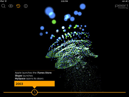
You can search for particular companies or domains and perform traceroutes to see how data moves between them, or you can also watch the Internet evolve over time. A timeline at the bottom pinpoints important years in the history of the web, like the launch of Wikipedia or last year’s SOPA blackout, and lets you explore how connectivity has increased over the years. Based on current data, they even predict what the Internet landscape will look like in 2020.
In the blog post announcing the app release, the company says they think of the map as “an educational tool that represents the Internet’s evolution from 1994 to present day.” Unless you already know a lot about networks and autonomous systems, it might more disorienting than educational, but at least it’s fun to play with.
You can check out CNN Money’s video overview for more:

Visualize the whole Internet with an app
