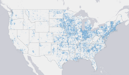
National Broadband Map Goes Live, Shows Vast Swathes of Unconnected Country
As promised, the Commerce Department’s National Broadband Map went live yesterday, showing the various types and speeds of internet connections...

As promised, the Commerce Department’s National Broadband Map went live yesterday, showing the various types and speeds of internet connections all across the country. It’s meant to function both as a tool for consumers and businesses, and as a wakeup call to the country–it’s pretty shocking to see just how much of the country lacks high-speed broadband.
The map cost about $200 million (provided by the National Recovery Act of 2009), and offers a database of over 25 million documents showing the type, speed, provider, and location of broadband service. The most obvious way to use the map is simply to search for an address or zip code, and then narrow down results by type of broadband. Then you can see the maximum advertised speed of broadband, if it’s available, which theoretically could be of use to businesses (they might not want to move to a location without reliable internet access) and consumers (ditto).
It also throws into sharp relief the fact that much of the country lacks broadband. Major population centers, like the Northeast Corridor, Chicagoland, Bay Area, Pacific Northwest, and Los Angeles-San Diego are blanketed, but much of the west, and even much of the southeast, are spotty at best. According to a survey released alongside the map (which was conducted last June), 68% of American households now have broadband access, up from 63.5% last year, but that leaves a pretty significant number out. This map may help the national broadband effort to spread the gospel of high-speed to more of the country.
You can search for yourself at the Broadband Map itself.