Sponsored Content
Gear
News, roundups, and reviews of the technology that shapes the way we live.
Latest in Gear


Sponsored Content
This $25 tool puts better AI into your Google Workspace

Sponsored Content
Learn 41 languages for a one-time purchase of $90


Sponsored Content
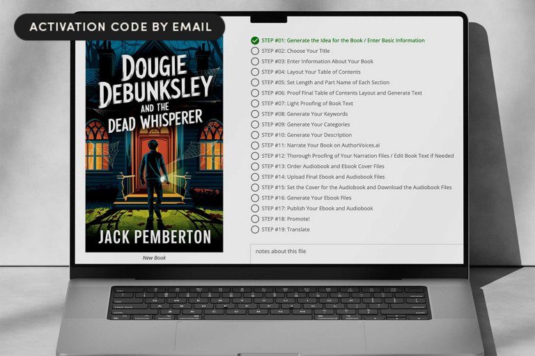
Create structured, publishable drafts with BookBud AI for just $99

Sponsored Content
Make your old PC feel new with Windows 11 Pro for only $10

Sponsored Content
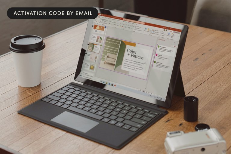
A full Microsoft Office Suite for under $30? Yes, this is real.

Sponsored Content
Make healthier choices with a tracker ring for under $300

Sponsored Content