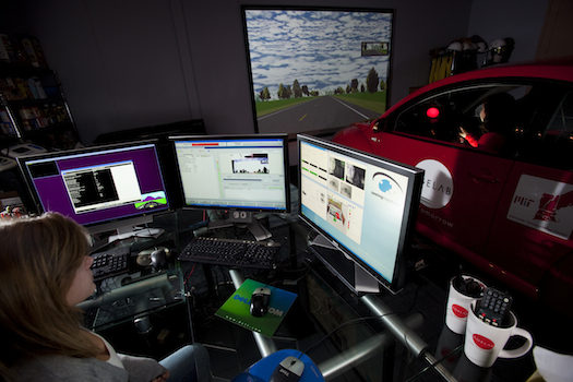

The basic interior of the automobile changed little in the latter half of the 20th century. “You had the steering wheel, the gas pedal, the brakes. And the display in there might have been providing a digital readout of the radio station,” says Bryan Reimer, a research scientist at the MIT AgeLab.
In the last decade, though, those displays have grown so sophisticated–or, rather, distracting–that even the typefaces used in them could impact how you drive, the lab’s latest study suggests.
The study, conducted in partnership with the global typeface design company Monotype Imaging, found that small changes in the typeface design of in-car text could have actual consequences on the road. “From our perspective, we’re absolutely not promoting more text in the car,” says David Gould, Monotype’s director of product marketing. “But whatever text is there should be as optimal as possible.”
Text overload
You’ve probably got in your car today a series of built-in LCD screens–complimented by your Garmin, your iPhone and your passenger’s Android–all telling you where you might dine tonight, how to get there and what your gas mileage will be. This mean that our cars are increasingly filling with text. And, of course, there’s only one way to process it: by taking our eyes off the road.
What’s more, the reading experience you have in a car is vastly different from, say, immersing yourself in a romance novel on an e-reader (another product with which typeface designers have been heavily involved). In a car, you glance quickly at text. You don’t revel in it. And so the designers at Monotype figured that the legibility of words and numbers on your in-vehicle screen would be particularly important.
Legibility rules
Not all typefaces are equally legible. Consider this illustration:

The top row of text is in a typeface genre called “square grotesque” and the bottom row is a “humanist” typeface. You may find the bottom row easier to read because it contains more open shapes (that “c” won’t look like an “o” when it’s shrunk down to 4-point type), because the letters are more clearly spaced apart, and because the forms themselves are distinct (there’s no confusing a “g” with a “9” or the capital letter “O” with a zero).
The AgeLab took these two typefaces and created digital menus you might see in a car (requesting address selections, restaurant options or content searches). In simulated driving studies, 82 participants aged 35 to 75 were asked to interact with these menus on a 7-inch LCD touchscreen, while an eye-tracking camera monitored them. The AgeLab also tested the screen at two brightness levels. The researchers were looking to measure drivers’ “glance time,” literally the amount of time their eyes drifted over to the device (and off the simulated road). Curiously, the two typefaces produced little change in glance time for the female drivers. But for the men, the results were significant. (“The gender issues here are a fluke of psychology,” Reimer posits, and they might relate to the different ways that women process information or interact with this type of technology.)
Across the two studies, the men required 10.6 percent less time to read the humanist text than the square grotesque. This may not sound like a lot, but that’s the equivalent of about 50 feet in distance in a car traveling at typical highway speeds.
“In the vehicle, fractions of seconds are the difference between avoiding accidents and colliding with things,” Reimer says. At 65 miles per hour, you cover 95 feet every second in a car. “In most other environments that we think of, the safety benefit from fractions of a second doesn’t have the consequences it does in a vehicle. Even in aviation, encroachments between planes are measured in minutes, not seconds.”
Beyond the lab
Reimer and Gould have already taken these findings to Detroit to share them with carmakers, and this research could have equal application for cell phone or other device manufacturers. All of these companies could use either an existing humanist typeface, or design new ones based on these same principles of legibility. Carmakers, Gould suspects, will likely want to find typefaces that communicate a unified sense of their brand. This sounds a little surprising. But, yes, the text on your dashboard LCD display is an integral part of the design of your car’s interior, too.

“Automobile companies are very big on their brand,” Gould says. “When you get in that car, you need to feel and have that emotion in that particular vehicle. They want to make sure that’s consistently represented on everything in the car, including on the screen.”
This research sugggests, though, that carmakers will have to find a serious balance between brand and safety.
“These little things we’re doing in the vehicle–how to optimize the relationship between drivers and the information being presented to the driver–really can add up to a lot,” Reimer says. And – of vital interest to carmakers – this is a relatively low-cost solution to the bigger problem of distracted driving. “We’re talking,” Reimer says, “about software changes here.”
