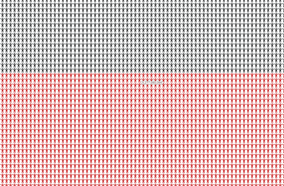

When you read on your computer screen that world population has surpassed 7 billion, as it did in 2011, it’s hard to put that number in context. It’s big a world. Where is everyone?
7 Billion World is a website/infographic that breaks it down. There’s a representative little figure for EVERY. SINGLE. PERSON. in the world, color-coded by what area of the world they live in. Asia is gigantic, and Oceania is maybe smaller than you’d imagine.
Hover over any of the people, and an icon will tell you what number they are out of the 7 billion. It’s a simple idea, but kinda makes you think about your little place in the big, crowded globe. Go ahead and try to find yourself on it by going here.
[7 Billion World via Digg]
