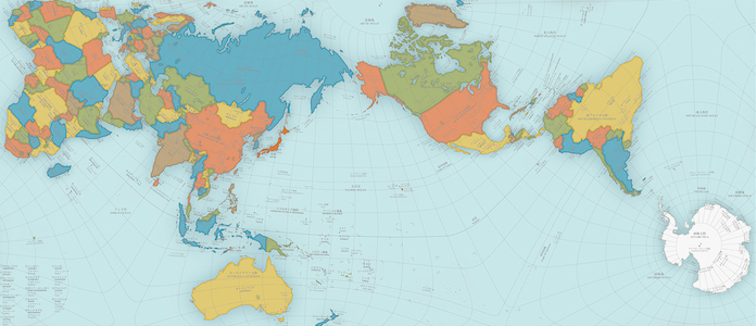

Riddle me this, flat Earth theorists: If the planet isn’t a sphere, why is it so hard to put it on a flat map?
At first glance, it seems simple. Just take the globe, peel off the outer layer and lay it flat. Congratulations, you have a map. But not so fast: spheres do not unfold easily into rectangles. Or any two-dimensional shape, for that matter.
No two-dimensional representation of our planet can get it quite right. It’s in the mathematics. But they can get awfully close, which is why one projection recently won Japan’s Good Design Award because of how well it projected our sphere onto a flat surface. The AuthaGraph World Map “faithfully represents all oceans and continents including the neglected Antarctica,” according to the award’s website.
It’s not a perfect map, but to even get as close as it did, architect Hajime Narukawa, the creator of the AuthaGraph map, had to cheat a little bit. Rather than trying to peel a sphere, he split the Earth’s surface into 96 triangles and mapped it onto a tetrahedron (think a three-sided pyramid). From there, the tetrahedron can be unfolded into a rectangle (or triangle, if the map-reader so desires) to give a much better representation of our planet in two dimensions–even if it does look a bit wonky compared to maps we’re more familiar with.

Narukawa created the AuthaGraph map in 1999. After catching on in Japan because of its precision, in 2015 it was included in the country’s high school geography textbooks.
So why did it take so long for a map this accurate to be developed, and even longer for it to make it into textbooks? It’s the same reason there are so many different flat projections in the first place: They serve different purposes.
When trying to peel the globe and lay it flat, you have to take a few things into account: Are the landmasses’ areas the right size compared to one another? Are the distances between locations accurate? Does everything have the right shape?
As a general rule, the more accurate you make one of those categories, the more the others get screwed up. It is really difficult to solve all three problems on one map. Even the AuthaGraph map has to sacrifice accuracy in distances and shapes in order to accurately show the proper areas of each landmass.

The most famous map is the Mercator projection–you’d recognize it as the map of choice in schools. It was created by the Flemish cartographer Gerardus Mercator in 1569, and has received extensive criticism because it makes the landmasses near the poles appear much larger than they actually are, as the West Wing demonstrated 15 years ago:

But even the Mercator map has a purpose–the straight lines of longitude and latitude make it easy for ships to sail the oceans, and it enjoyed widespread popularity for centuries as a navigational map.
As for how it become the map of choice in schools? No one’s really sure, but as far back as 1946, some cartographers have claimed that preference for the map stemmed from imperialistic motives because it made European countries appear bigger and therefore more important.
At least the AuthaGraph map doesn’t have the same problem. Not only does it preserve the relative size of each country, you can choose any location on the globe for the center and it will be just as accurate.
