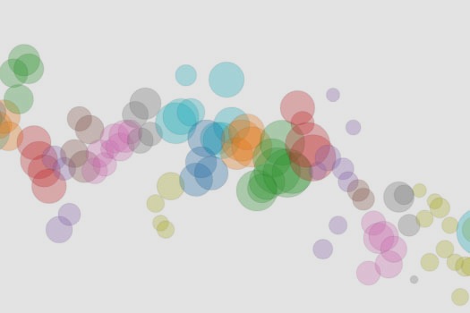

The dawn of agriculture is often cited as the beginning of modern civilization, since it allowed people to live for a long time in one place and build large societies, but one thing it didn’t change was our species’ propensity for migration: as of 2010, more than 215 million people–about 3 percent of the world’s population–were living in countries outside of their own.
Using data from the World Bank, information designer Carlo Zapponi created an elegant visualization showing the flow of people to and from every country in the world. Line thickness represents the relative proportion of people coming from, or going to, each country.
Check out the visualization here.
![What’s The Most Corrupt Government In The World? [Infographic]](https://www.popsci.com/wp-content/uploads/2019/03/18/2DQREMMUSZI4BQMQGZR6SNF3B4.png?quality=85&w=525)
![Where The World Lives, By Latitude [Infographic]](https://www.popsci.com/wp-content/uploads/2019/03/18/P7OV5ATL56SAMTU3TDRTJXTKHU.jpg?quality=85&w=525)

![Your Complete Guide To Chocolate Flavors [Infographic]](https://www.popsci.com/wp-content/uploads/2019/03/18/3U4DT76G5KMOJFEKYG5UQO5CYM.jpg?quality=85&w=525)
![Mapping The Birth Of An Art Movement [Infographic]](https://www.popsci.com/wp-content/uploads/2019/03/18/OWDEOFDYNQGFPNWYVIPGNSHY4E.png?quality=85&w=525)
![A Map Of The World, According To Wikipedia Geotags [Infographic]](https://www.popsci.com/wp-content/uploads/2019/03/18/ZIA2AE5K6ERN6VJU6SB722T42M.jpg?quality=85&w=525)
![How The World Wastes Food [Infographic]](https://www.popsci.com/wp-content/uploads/2019/03/18/ZXZIAKEH6MY2U37GZ2Q4ZJACMY.jpg?quality=85&w=920)
