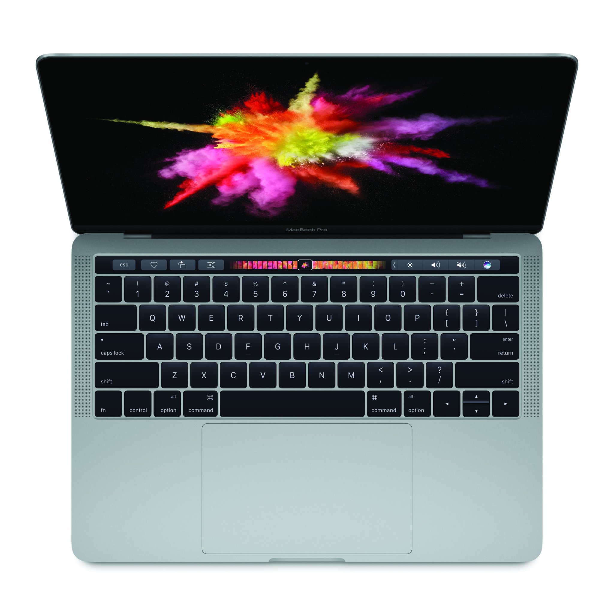

It’s been four years, four months, and 16 days since Apple has released a major update on its beloved high end notebooks. Today we found out, what Apple spent their time on and TL;DR: it filled me with a reptilian urge. As someone who loves this company, I’m starting to worry that they are resting on their laurels and unable to make the hard decisions they were always known for.
There’s no doubt that we’re in an awkward phase of pro computing. If you’re Apple, Google, or Microsoft, it’s a tough question: How do you take the most compelling aspects of visual multitouch and integrate them in a pro mouse and keyboard interface?
Combining these interfaces is awkward and challenging but Microsoft has given it a shot. The Surface started as a fairly elaborate mess but has gotten better with time. They eventually introduced a solid tablet/laptop combo called the Surface Book, then yesterday, Microsoft released a product that left many spellbound.

So, four years later, while Microsoft shipped and iterated on multiple Surface designs, we get this multi touch sliver from Apple.

There are certainly some fun aspects of the Touch Bar. It looks pretty and has a few minor, amusing use cases but honestly WTF.
In the thousands of interviews Apple did with creative professionals about their computer needs, how many of them said, ‘You know what! What I really want is a small sliver above my keyboard that I can touch and receive error messages on!
Can you imagine how many hours Apple poured into this? How many Apple teams had to work together to make this happen? How much it had to pressure partners into making something custom for this for demo day? And for what? How does this move the needle in any meaningful way for creative pros?
It’s worth mentioning at this point that the 2015 MacBook Pro I’m writing this on is the finest computer I’ve ever owned. The trackpad, keyboard, and OS are all refined in a way no one else comes close. But when it comes to the 3D creative work I need to do, its a well shaped paperweight. Working with HTC Vive, Oculus, or high end 3D graphics “requires” an obscene GPU. There might be some hacky way to do it with USB C but Apple appears to give no fucks.
The MacBook Pro Tool Bar is a scab. It’s a glaring, congealed distillation of Apple’s disconnect with the creatives it was so famous for previously supporting. I’ve had no choice but to buy a Windows machine for work and it seems that will be the case going forward.
***
Cody Brown is the founder of the VR production studio IRL and Roomscale.org. His previous company scroll kit, was acquired by WordPress.com
This post was originally published on Medium and re-published here with the author’s consent.
