The Planet’s Population And Growth In A Clever 3-D Bar Chart
One of our 15 favorite recent data visualizations
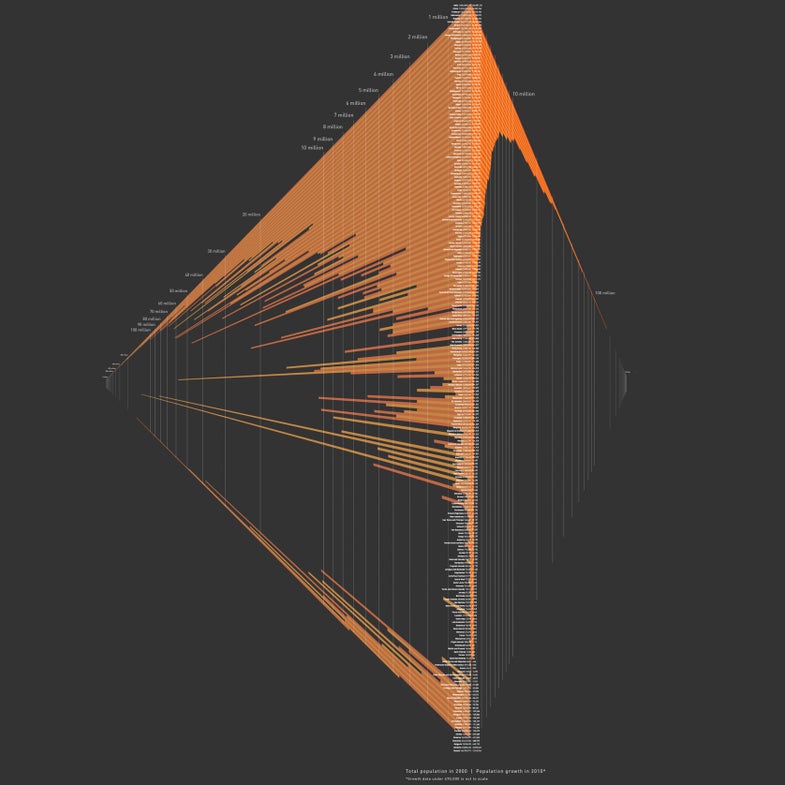
Comparing wildly disparate numbers is a perpetual challenge in visualization, but Ariana Montanez added a twist to a traditional bar chart to accomplish just that. Each bar on the left is the population of a country in 2000, with the change in that figure by 2010 on the right. The illusion of three-dimensionality allows the 1.4 billion people in China to appear side-by-side with the 32,000 residents of the Liechtenstein.
See all 15 of our favorite recent data visualizations here.
This article was originally published in the November 2014 issue of Popular Science, under the title, “Dawn of the Data Age.”

World Population