
We may earn revenue from the products available on this page and participate in affiliate programs. Learn more ›
Since Windows 7, Microsoft’s been busily honing the interface for Windows tablets, which uses a bold bunch of squares and rectangles in flat neon colors and has been christened “Metro.” Windows 8–undoubtedly the biggest change to the operating system in a few generations–finally brings Metro to the desktop. So how does it work with a keyboard and mouse?
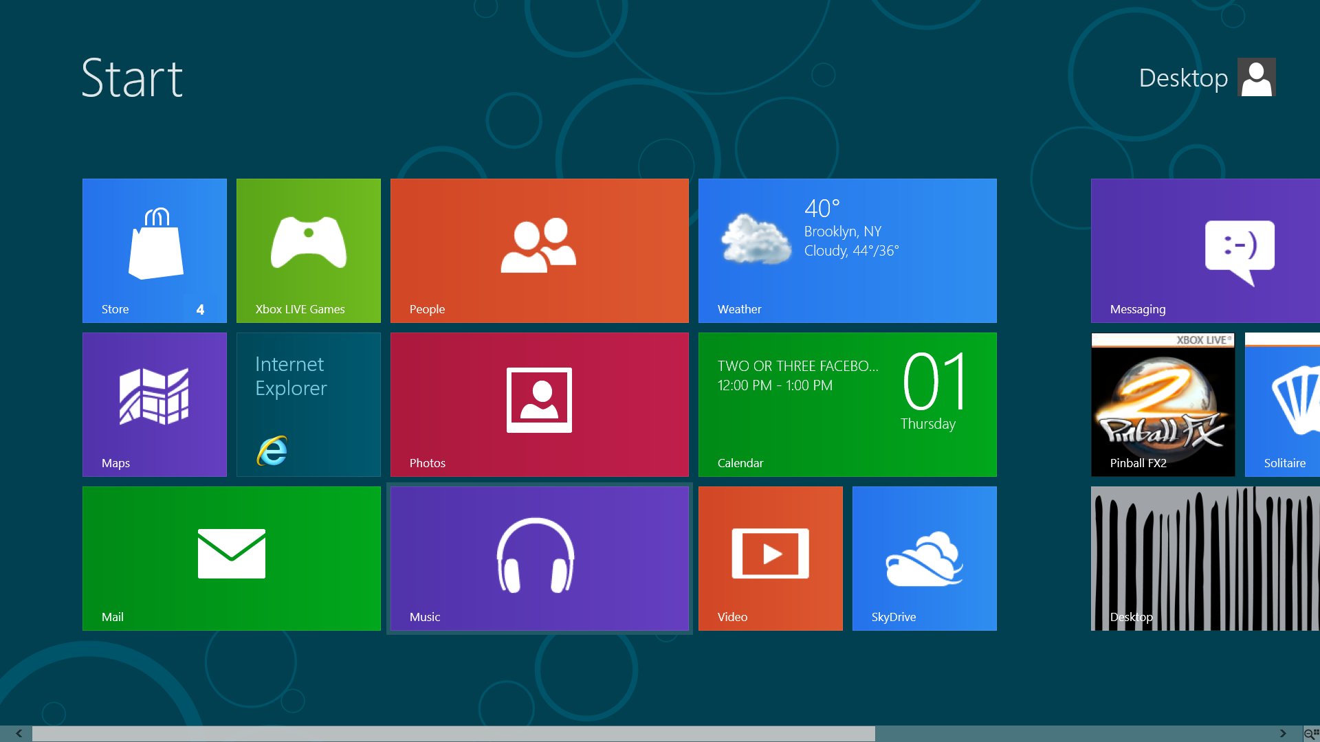
Windows 8 integrates Metro with what in reality is a barely-changed version of Windows 7, with all the programs and behavior we’ve gotten familiar with for the past decade or two. It sounds disjointed, but functionally, after using it for a minute, I see what Microsoft is doing here, and it makes sense. For tablet users, Metro is everything. For desktop users, it’s essentially Microsoft’s new Start menu.
On a tablet, Metro is highly touchable, with big buttons and swipey gestures and pretty bright colors. Apps run in full-screen, with the additional option of sticking an app in a quarter of the screen on the left or right (great for stuff like Twitter or an instant-message client). On a desktop, Metro’s still useful, but it’s not where you’ll spend most of your time. A desktop user triggers Metro by clicking, from anywhere, on the lower left-hand corner of the screen (or by hitting the Windows button on your keyboard), and there you are: home base.

Metro is where you see basic updates. You can go into a pretty weather app, check your email, look at photos, listen to music (no longer called Zune, which is smart; despite Zune being reliably excellent throughout its tenure as Microsoft’s most-mocked property, it was also reliably unpopular), play some quick games, or do a little light messaging. It’s also the spot from which you’ll launch all your apps. Here’s where it gets kind of tricky: there are two kinds of apps, Metro apps and regular Windows apps. You can “pin” both of these types of apps to your Metro screen, anywhere you want, but the Metro apps will launch in Metro and the Windows apps will launch in regular Windows (which, as I said before, looks pretty much exactly like Windows 7).
Metro is pretty simple to use. A right click brings up a sidebar on the bottom (bottombar?) with context-sensitive options. You scroll through your Metro thumbnails with the mouse wheel (or, once Windows 8 is optimized for laptops, with the trackpad). The hot corners, to borrow a phrase from Mac OS, work whether you’re in Metro or not. Stick your cursor in the upper left corner to see a little popup of your most recently used app, which you can click on to be taken there. Or you can move the cursor down to see more of your recently used apps. At the bottom of this list is always a thumbnail of Metro–your new Start button. (I imagine many desktop users will stick to the tried-and-true Alt-Tab method of app switching–it’s quite a bit faster.)
Over in the upper right-hand corner, you’ve got what Microsoft calls “charms.” These are a couple quick, important keys: Search, Share, Devices, Settings, and another Start button. Not sure why there are two Start buttons available at all times, but there they are. The search function is Metro-fied and works well, but it’s not universal–you have to tell it whether you’re looking for an app, a setting, or a file. Mac OS X’s universal search “Spotlight” is better, I think, but this works pretty well.

Tablet users, I imagine, will stay pretty much entirely in Metro. It’s just right for touch-based interaction on a small screen. But desktop users will be just the opposite: you might look at the weather app in Metro, or use the Metro calendar, or maybe check your email (though the email app has some issues; read more below in the “apps” section), but I can’t imagine a desktop user wanting to use, say, a Twitter or instant-message app in Metro. For one thing, you’d have to keep leaping between your desktop and Metro, which is kind of jarring (Alt-Tab includes both Metro and regular windows apps)–even more than heavily using widgets on Mac OS or gadgets in Windows 7, and those are nowhere near as involved as Metro apps. For another, Metro apps are designed to be super lightweight and speedy and simple. That’s fine for some stuff, but the email app is basically a touchscreen email app–if I’m using a desktop computer, with a keyboard and mouse and an ugly black tower filled with space-age components, why wouldn’t I just use an email app like Thunderbird, or even a web-based client like Gmail, both of which are more powerful, flexible, and better suited for keyboard-and-mouse use than Metro’s email app?

METRO APPS
Given that this is a preview and not a finished product, it’s expected that there’s a very limited number of Metro apps. There’s no Twitter app, no Facebook. The only IM client is Microsoft’s own, which doesn’t support Google Chat or AIM, only Facebook and Windows Live Messenger (good for 14-year-olds and Europeans, respectively, but I am neither). There are a few simple games, and the Xbox app has some interesting possibilities–looks like you’ll be able to send videos to your Xbox 360 in addition to the expected access to Xbox settings and friends.
The email app is super pretty, as is basically everything in Metro, but it’s also super simple. When I’m on a desktop, I can’t imagine using this app over a regular email program or a decent web app. There’s not enough room left for the actual message, not enough controls, not enough information on the screen, compared to the alternatives.
The calendar app is excellent, much cleaner and simpler than previous Windows calendars or even Apple’s iCal, with its silly digital leather stitching. The music app is far too basic for desktop use–I have a keyboard and mouse, why do I need to scroll through a billion giant thumbnails? (The Music and Video apps are tied in pretty thoroughly with the formerly-named Zune store.) On the other hand, the photos app is simple, but works nicely–I like having a simple photo app that just shows me my photos. It’s not going to replace Picasa, which has much more robust uploading and editing and management tools, but to just take a look through some photos? Great.
WHAT ABOUT THE REST OF WINDOWS?
There haven’t been any real major changes to the “normal” part of Windows 8. Windows Explorer is still Windows Explorer. There are some slight granular differences in the menu bars and things like that, but nothing will really be shocking to anyone who’s used Windows 7. The Start icon is gone from the taskbar, but otherwise it looks exactly the same–you right-click on any app in the “all apps” section of Metro, and hit “Pin to taskbar” to stick it right there. All of those great Windows 7 previews are still here, so you can hover over the items on the taskbar for a preview and things like that.
Internet Explorer does not suck. I’m as surprised as anyone. It’s pretty and fast and minimal. It doesn’t have a killer feature like Firefox’s scores of extensions or Chrome’s search bar, but it does not deserve scorn, which is high praise for this particular dinosaur of a program.

The Control Panel is still confusing as all hell. You can use the new “PC Settings” area in Metro for basic stuff–accounts, personalization, notifications, updates–but it’s a pretty shallow set of options for a desktop, and you’ll definitely have to close your eyes and plunge your arm into the toilet of Control Panel at some point. Microsoft promises that they’ve vastly cut down on the quantity and incomprehensibility of error messages, but as I didn’t see any, I can’t vouch for that. Or can I?
All of my Windows 7 programs worked. Actually everything seemed to work a little better than before–maybe it’s just that Metro is so ridiculously smooth and fast, but the whole computer felt snappier than I remembered Windows 7 ever being. (For reference, I’m using a few-years-old Dell desktop with 8GB of memory and a triple-core AMD Phenom processor–faster than your average workstation, but by no means a speed beast. As a side note, I had to dig it out of my closet, where it was entirely covered with dust, and plug it into my HDTV, because I no longer have a monitor, so all things Metro seem impossibly bold and bright. I tried to install it via both Boot Camp and Parallels on a Macbook Pro, hoping to try out some multitouch, but had no luck in getting it to run in any reasonable way. This will probably change soon.)

SINCERELY, IN CONCLUSION
I like Windows 8 a lot! But it’s important to remember that while Windows 8 is a huge, game-changing step for tablets, in the desktop world it’ll be more like the step from Snow Leopard to Lion on Mac OS. It brings a whole bunch of tablet ideas, but it’s still a desktop OS, and it’s really not as different from the previous version as it sounds or looks at first. And, by the way, Windows 8 is going to freak the hell out of a lot of people–Metro is the first thing you see, and you’ll keep going back to it for settings and launching apps and things like that, and it looks like Microsoft burned Windows to the ground and built a new OS out of neon construction paper and a T-square. But it’s really not a huge deal–desktop users will treat Metro like the fanciest, best Start menu/app launcher there ever was. And it is, too; Metro’s changes are infinitely more modern and welcome than Lion’s weird, useless iPad-like app launcher and all the other mobile-inspired ideas Apple crammed into the latest version.
I have no hesitation in recommending an upgrade; I’ve had absolutely no hiccoughs or errors after my upgrade, everything runs perfectly smooth, and Metro is, though not a gamechanger, really, really cool. Especially if you haven’t played with other Metro products like the new Xbox homescreen or Windows Phone, it’ll be a shock–but after you figure out what Metro is and what it isn’t, it’ll be just fine. Better, even.
You can download the Windows 8 Consumer Preview from Microsoft here, for free. It’ll expire in late 2013.
