We may earn revenue from the products available on this page and participate in affiliate programs. Learn more ›
Today, Google fully demonstrated the next version of Android, version 3.0–also known as Honeycomb–to the press, finally showing off the completely redesigned interface, the new app strategy, and the first tablet to use Honeycomb: the Motorola Xoom. This is the first tablet to really offer a challenge to Apple’s iPad, and one of our favorite gadgets from this year’s CES, so it’s really exciting to see both hardware and software in action.
Android has moved slowly to tablets. There are a few already on the market, like the Samsung Galaxy Tab, Dell Streak, and Barnes & Noble Nook Color, but Google has actually discouraged tablet-makers from getting into the game until now. Android 2.2, the version seen on most current Android tablets, is also the version used on most Android phones–and it looks it. Google, as it turns out, was working on a tablet-specific version of Android that would take full advantage of the larger screen space and extra power of a tablet, much different than the engorged-smartphone tactic of current tablets.
Android 3.0, known as Honeycomb, is a drastic change for Android, which was formerly categorized by rapid but small improvements. That’s largely due to the influence of Matias Duarte, a brilliant designer poached by Google from Palm. Duarte had previously created Palm’s WebOS, a critically-adored operating system, as well as older interfaces for Sidekick and Helio. (Interface or design fans can check out his interview with Engadget.) Duarte’s influence is all over Android 3.0, which retains little of the Linux-y awkwardness of earlier versions.

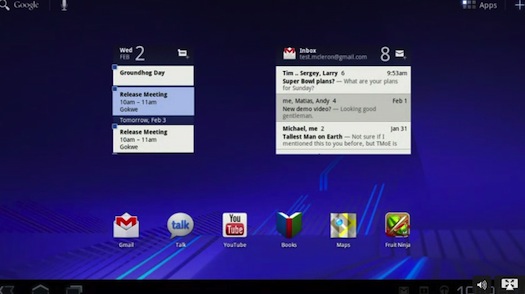
The biggest change is the elimination of the buttons. Every button. Current Android phones all have four buttons: Home, Back, Menu, and Search. But with the added space offered in a 10-inch tablet, Android 3.0 is able to instead use a small portion of the bottom of the screen for a tray, which boasts Home, Menu, Back, and Currently Running Apps icons on its left side, the latter of which shows screenshots rather than mere icon images. On the right side of that tray is the new notification button: Instead of the pull-down drawer that’s become almost iconic in Android, the new notification section pops up from the bottom, and offers much more detail than before. You can pause or change tracks while playing music, see recent Twitter updates (with pictures), and more.
Google has also taken a big step forward in terms of consistency throughout the OS, and a major component of that is the Application Bar. The closest analogue for the Application Bar is actually the menu bar in Apple’s Mac OS: It’s a dynamic but constantly present bar on top of the screen that changes to suit the app you’re currently using. It’s a great idea: If you want to do something in an app, from adding a new item in your grocery list to refreshing your Gmail inbox, you know the option will be in the same place, regardless of app or even what you’re trying to do.
The homescreen looks different as well, with a smooth blue look that almost seems at odds with earlier versions of Android, which mostly used grey, green, and orange. Widgets will be a major part of the Android homescreen, in direct contrast with the iPad’s layout. Widgets can display your inbox, Twitter and Facebook feeds, music, chats, and lots more, and let you perform small actions without opening an entire app.

Google is pushing a paneled concept for Honeycomb apps: They’ll have multiple panels, sort of like the iPad’s email app. In Honeycomb’s Gmail app, you’ll have one panel, or column, that lists your inbox messages, and a bigger panel that actually displays the message. Google showed off a few apps, some of which are familiar (Google Maps, Fruit Ninja) but some of which are really exciting. Google Body, which lets you explore the human body the same way Google Earth lets you explore the planet, is of particular interest to us, but the game offerings are also really impressive–Monster Madness, for example, is a direct, 100% complete port from the Xbox 360, which is pretty incredible on a mobile device.
Other welcome changes include a new web store for the Android Market, plus new music and camera apps for Honeycomb. The Android Market web store is live now, though there’ve been some difficulties downloading apps immediately following its launch.
The Xoom, a 10-inch tablet using Nvidia’s Tegra 2 processor, was the test model for this demo, and seemed to perform well. It’ll probably be the first Honeycomb tablet, and it’s probably not far off–possibly coming in as little as a few weeks. The Honeycomb experience as a whole was largely a hit, with testers finding it smooth, eye-catching, and sophisticated to a degree no other Android device has managed. We’re really excited about the Xoom and Honeycomb as a platform–looks like the iPad has some serious competition, for the first time.
[Images via Gizmodo]