Google Earth Environment Guide
The free software from Google gives scientists a new world view
Crunching massive, geographical data visualizations used to require expensive mapping software and powerful computers. Now, Google Earth is becoming the go-to application for scientists who need a cheap way to animate huge sets of 3-D data right on their home desktop. These five projects show how a simple tool can reveal hidden patterns in everything from ash to emotions.
The Volcano Tracker
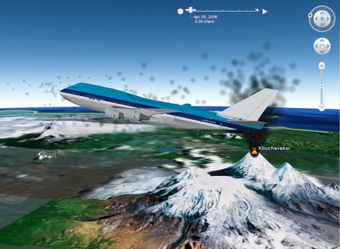
On December 15, 1989, the 231 passengers aboard KLM Flight 867 were cruising at 28,000 feet over Alaska when a strange sulfur smell filled the cabin. Suddenly all four engines quit, and the Boeing 747 started to plummet. The pilots had skirted the edge of an ash plume billowing from Redoubt volcano, about 150 miles away. The ash, mostly made of tiny particles of rocks and glass, was almost invisible. “It melted and resolidified inside the engines, and they stalled,” says Peter Webley, a researcher at the University of Alaska’s Volcano Observatory. Flight 867 and its horrified passengers fell more than two miles—13,300 feet—before the pilots managed to restart the engines and land in Anchorage.
To prevent another near-crash, scientists at the university began the Puff Prediction project in 1989 to help air-traffic controllers divert planes away from dangerous plumes. Starting with wind data from the National Weather Service for all altitudes between the Earth’s surface and 52,000 feet, scientists “release a set of virtual ash particles into the model over a volcano and track where those particles go,” Webley says. In 2006, he began to use Google Earth to create three-dimensional animations that show where and when the ash cloud will be at any given time. The puff predictor updates forecasts every six hours for each of a dozen potentially erupting volcanoes in the North Pacific.
National Weather Service forecasters at the Volcanic Ash Advisory Center monitor the puff predictions in Google Earth and alert air-traffic controllers, who create no-fly zones around potentially dangerous plumes. Stalled engines aren’t the sole concern. “It’s like driving behind a truck that’s kicking up stones on the highway,” Webley says, “only you’re traveling at hundreds of miles per hour with little particles smashing into you.” Word has spread, and he regularly gets requests for puff predictions from Australia, Ecuador, Mexico, Italy, Russia—just about anywhere with a volcano and a flight path.
See a directory of current 3-D puff projections for Google Earth here.
The Storm Trooper
Hurricane hunters plot a course with real-time satellite data
The nasa jetliner took off with eight crew members and 38 scientists on a mission to study how hurricanes form. Its target was the tropical depression swirling over the Atlantic Ocean near Cape Verde, Africa, that would soon strengthen into Hurricane Helene. Pilots planned to fly a figure eight through the nascent storm while scientists inside the McDonnell Douglas DC-8 sampled atmospheric conditions with an array of onboard sensors. An hour after takeoff, a scientist tracking the flight radioed with an urgent message: Veer left to avoid a barrage of lightning dead ahead.
![Here and above, from different angles: As scientists flew into the growing storm, ground crews monitored real-time satellite images overlaid with the planned route [green] and actual track [red] of the DC-8. When lightning [yellow crosses] appeared in the plane's path, the crews directed a move to the left to avoid danger.](https://www.popsci.com/uploads/2019/03/18/NQPEOF2B6WLMGR6Z7UQYT6EVMA.jpg?auto=webp&optimize=high&width=100)
Side Step
That data came from the Real Time Mission Monitor (RTMM), a tool that uses Google Earth to combine up-to-the-minute weather imagery with live aircraft flight data. “We were able to see that the lightning intensity was pretty strong, and we wanted the plane to avoid a bad situation,” explains Michael Goodman, an atmospheric scientist at NASA’s Marshall Space Flight Center, which manages the project. “Prior to the RTMM, when we would do airborne field experiments, the planes would take off and those of us on the ground couldn’t follow them,” Goodman says.
Besides keeping aircraft out of harm’s way, program managers use the RTMM to ensure that scientists stay near the action. “These are dynamic weather situations,” Goodman says, “so we are much better able to coordinate our assets if we know where a plane is in relation to the weather.” The goal, after all, is to study storms up close, and that often means playing dodgeball with lightning.
Emotion Map
Thousands of well-measured steps show how to build a city
Google Earth always bothered Christian Nold. “There is something odd about the way it makes the whole world look the same,” says Nold, an artist and designer who lives in London. “It has no representation of local differences.” Three years ago, he set out to change that. He wired 100 volunteers in Greenwich, England, with wearable devices that recorded their GPS location and “galvanic response”—the same sweat test used in lie detectors. He then instructed his subjects to go for a walk and note any flurries of excitement. After about six months, Nold combined all the data in Google Earth and unveiled the first interactive map that melded geography with human sensory data. A fly-through tour of Greenwich is jammed with color-coded sensory spikes (each volunteer is assigned a unique color) and accompanying textual annotations. “I like animals . . . lots of ducks and geese here,” comments one user. “Ugly. How can anyone live there?” asks another, who registers a sharp rise on her emotion meter. And perhaps most distressing, “New roads make it confusing to get to the pub.”
Taking Heart
Nold dubs the process “biomapping,” which he conceived of as an art project. But when city planners and community groups saw his work, they immediately enlisted him as a consultant. His emotion maps, they reasoned, could be used to pinpoint urban blight. “We could see how people were reacting to social spaces, like parks and plazas, or where there were strong reactions at traffic crossings,” Nold says. He was, in effect, bringing hard data to the guesswork of urban planning.
Thanks to Nold and more than 1,000 volunteers, there are now emotion maps of Suomenlinna, Finland; Siena, Italy; Rotterdam, the Netherlands; San Francisco; and half a dozen areas in England. Next up: an emotion map of Paris, and a map of noise pollution near a London airport that’s slated for expansion.
Download the Greenwich, England biomap here [KMZ file]
Arctic Eye
Time-lapse views of melting ice caps reveal disturbing changes
As a research scientist for the National Snow and Ice Data Center (NSIDC) at the University of Colorado, Walt Meier has spent uncountable hours examining satellite images of ice caps. “Generally we just look at images side by side,” Meier says. But spotting dynamic trends with static pictures isn’t easy. Last year, Meier and his colleagues began adding daily images of Arctic sea ice to Google Earth. “We animated, in a time series, a set of still images, and we immediately saw something crazy going on.” In just two months, more than half the Arctic sea ice had vanished.
![The ice cap last September [left] and October [right], along with the past average ice cover in those months [pink outline]](https://www.popsci.com/uploads/2019/03/18/AMTKKXYPNSRPXFKXMDPDNMHNPQ.jpg?auto=webp&optimize=high&width=100)
Thin Ice
Since nothing is ever simple in climate science, Meier can’t be sure that melts like these will become the norm. Last year’s dramatic melt, scientists surmise, was partially the result of a long-lived low-pressure system that parked itself over Siberia and pumped warm air from the south up to the Arctic. But Meier believes that Google Earth could help predict any imminent melt-off. “The big advantage is that we can bring in other data sources, like air temperature, weather and ocean currents, to be overlaid with sea-ice data. That really lets us see what’s going on.”
In the meantime, NSIDC glaciologists have integrated ice data from around the globe with Google Earth. They’ve animated 25 years of vanishing ice in Greenland and the breakup of the Larsen B ice shelf in Antarctica and documented peripatetic icebergs in the South Atlantic Ocean, dwindling permafrost, and receding glaciers in Alaska. For anyone who still doubts that Earth’s ice is creeping toward extinction, Meier has a movie to show you.
View NSIDC data on Google Earth here.
The Flight of the Bird Flu
Tracking an ever-changing virus could help stop a pandemic
Influenza viruses have a nasty habit of mutating constantly. This makes it hard for scientists to develop effective vaccines. Just when virologists think they’ve got the little buggers figured out, a virus morphs bits of its genome to remain a cunning infection machine. Daniel Janies, a professor of zoology at Ohio State University’s department of biomedical informatics, has been tracking these mutations in the H5N1 avian-flu virus for years. But once he loaded his data into Google Earth to map changes in RNA by location, he saw something unexpected. “Not only was the virus moving westward,” Janies says, “it was mutating in a way that allowed it to infect mammals, making it more dangerous to human populations.”
Hot Zones
The map revealed another curious twist. In addition to “avian flu hopping, skipping, and jumping across Southeast Asia, it was being moved very rapidly and very far by some other process,” he says. One case, in October 2004, showed a strain jumping 5,700 miles from Bangkok to Brussels in a single bound. On further investigation, Janies learned that the virus had hitched itself to a crested eagle purchased at a local market and illegally shipped to Europe in someone’s carry-on.
Janies is now tracking 1,000 avian-flu strains, or “isolates”—more than three times what he started with—as they march around the globe. He’s building a Google Earth database for seasonal influenza. And his team is mapping H5N1’s resistance to certain drugs by location, a project that could help stop a potential pandemic. Knowing where and when the virus mutates is critical to developing a vaccine. “If there is a human outbreak,” he says, “we want to be able to get new virus data at 5 p.m., let our supercomputers run with it overnight, and give you an updated mutation map in the morning.”
Download the H5N1 Visualization for Google Earth here [KMZ file]