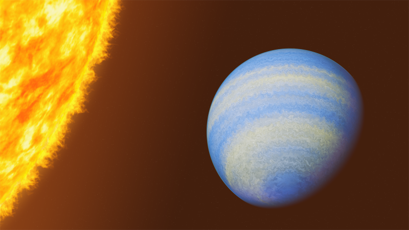
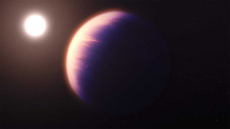
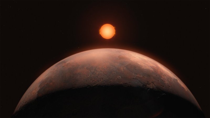
SHARE

Planets orbit their host stars, arranged as they are in the night sky. Courtesy Goldilocks.info

The number of known exoplanets now numbers in the thousands. A new explorer tool, released today, visualizes them all with an eye toward finding the most Earth-like. It’s called Goldilocks, after the idea that for a planet to be habitable, it has to be not to hot, not too cold, but just right.

The project is by data visualizer (and friend of Popular Science) Jan Willem Tulp, in consultation with experts at the European Space Agency. It’s exoplanet data sliced many ways: In one view, stars are placed as they are on the night sky [above], and a dense cloud of planets pops out where the Kepler space telescope trained its eye. In another, planets are arranged by their similarity to Earth:

Known exoplanets are arranged by how closely they resemble Earth, with the most Earth-like at the center. A few planets come close, but so far, a true Earth twin remains elusive.

The Earth Similarity Index

Known exoplanets are arranged by how closely they resemble Earth, with the most Earth-like at the center. A few planets come close, but so far, a true Earth twin remains elusive.

But if you’re not in the mood for a science lesson, they also just look nice:

The known exoplanets that cross their stars’ habitable zones are all visualized orbiting a single central point, scaled to a single habitable zone [in blue]. Courtesy Goldilocks.info