The American Association for the Advancement of Science calls it a crisis. Atmospheric scientist Timothy L. Killeen, the president of the American Geophysical Union, says it “could harm our ability to protect our citizens.” We call it plain old scary. It’s the endangered future of our nation’s arsenal of Earth-observing satellites, the 42 instruments that enable scientists to monitor the planet. Satellite images and colorful data sets like the ones on the following pages help researchers track killer hurricanes, plan conservation efforts, manage water resources, and predict glacial melting.
Yet our fleet is aging, and badly.
A recent National Research Council report predicts that by 2010, the number of working satellite sensors will drop by 40 percent. Even more troubling, it warns that the next generation of sensors won’t be able to adequately address the ever more intricate questions that scientists will pose about the land, sky and oceans over the next decade.
Blame in part the shifting priorities of NASA, one of the main agencies that manage our satellites. NASA’s earth-science budget decreased 30 percent between 2000 and 2006. Although the space agency has requested a $1.1-billion increase over 2007, most of its budget is going to fund the International Space Station and President Bush’s Vision for Space Exploration, a plan to send humans back to the moon by 2020 and, ultimately, to Mars.
We support sending humans to space, but let’s not forget where we live now. The U.S. needs a timely recommitment to Earth observation. Otherwise, our ability to monitor, predict, and respond to dire environmental threats will continue to erode.
To see what our satellites reveal about the changing planet, launch the gallery here.
Seals from Space Sea creatures are our next army of environmental-data collectors
Meet the newest ocean sensors: elephant seals. These zigzags represent the migration patterns of 11 females between Baja California and the Gulf of Alaska. iPod-size satellite tags glued to their heads recorded the depth, temperature and salinity of the water they swam through and then relayed the data to researchers. The Tagging of Pacific Pelagics initiative, a program of the Census of Marine Life, plans to outfit 23 marine species, including bluefin tuna and white sharks, with 6,000 tags by 2010. One surprising finding so far: A weird warming of California coastal waters in 2005 forced tagged sea lions to venture offshore up to 300 miles in search of food.
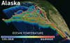
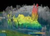
Arctic MeltdownRipples mark a dramatic 3-D view of a shrinking glacier
The frozen lobe of the behemoth Malaspina glacier wrinkles as the faster-moving valley glaciers behind it push it toward the Gulf of Alaska. To create this accurate 3-D view, NASA scientists draped a satellite image over detailed topographical data acquired during a flyover of the space shuttle Endeavour in 2000. The project was the first to map the elevation of ice masses in high resolution around the world, providing scientists with baseline measurements with which to gauge future changes. The shallow end of this Rhode Islandâ€size glacier is melting swiftly. Glaciologists have determined that areas of the glacial lobe were 98 feet lower in 2004 than they were in 2000. That’s double the rate of pre-1999 thinning.
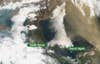
No Silver LiningsA giant, polluting, climate-tampering cloud stalks the U.S.
NASA’s Aqua satellite imaged this brown shadow of dust, soot, smog and other pollutants floating on the prevailing winds over the Sea of Japan in 2005. Such plumes are lofted into the sky by sandstorms in the Gobi Desert, pick up industrial emissions over China’s megacities, and disperse across thousands of miles of the Pacific Ocean, all in a matter of days. The uppermost cloud layers can travel as far as the Atlantic Ocean. Scientists are still unsure how much of the dusty soot settles into the lungs of North Americans. But they do know that the particles block sunlight and change regional temperature and precipitation patterns, which can mask global warming and modify storm tracks.
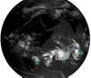
It’s Cold at the TopIf the world is getting stormier, these satellites could show it
You’re seeing the frigid tops of Earth’s clouds captured in a single moment in February, the height of the Pacific cyclone season. Cyclones Favio [A], Gamede [B] and Humba [C] spin toward Africa. This seamless mosaic, developed by NOAA’s Climate Prediction Center, stitches together strips of data from five weather satellites. Their sensors measure infrared radiation (heat) in the atmosphere, so the colder the cloud, the whiter its trace. The ghostly shapes of continents appear dark because the sun warms landmasses in the daytime. The data set, which is captured every half-hour, is the first to deliver a whole-Earth, near-real-time view of how storm systems evolve.
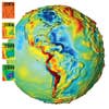
Global Warming Means Massive ChangeThe first satellite to measure subtle differences in Earth’s gravitational field is helping s
Forget what you learned in high school: The pull of Earth’s gravity is not 9.81 meters per second squared everywhere. For proof, look no further than this global gravity map, which shows where Earth’s gravitational force is stronger or weaker. Red indicates areas of high mass-often mountain chains-that exert extra gravitational pull. This image is based on data captured by the twin satellites of NASA’s Gravity Recovery and Climate Experiment, or GRACE, from 2003 to 2006. The satellites measure the gravity of the entire planet every 30 days. Because GRACE detects mass, it can track where ice accumulates and melts on Earth’s crust, providing a critical gauge of global warming. For instance, it has enabled scientists to quantify the dramatic loss of ice in the southeast of Greenland since 2003. If all of Greenland’s ice were to melt, global sea levels could rise by 23 feet, submerging Florida’s lower third, among other coastal areas. ON THIN ICE: Greenland´s ice melt (left) shows up as a loss of mass [blue and purple] in these gravity maps.
Red Hot Clouds Scientists scrutinize “hot towers” to predict nightmare storms
You’re looking at thunderclouds, 11 miles tall, brewing inside Hurricane Rita as the storm scrapes past Cuba in September 2005. This image was created using data captured by NASA’s Tropical Rainfall Measuring Mission (TRMM) satellite, the only space-based instrument that can measure where and how much rain forms deep inside a hurricane. The thunderclouds, known as “hot towers,” serve as a yardstick of a hurricane’s latent heat. The red shows where rain is at its highest altitude. Since water vapor releases heat as it condenses, taller, rainier clouds can mean more powerful hurricanes. Pinpointing such hot towers enables scientists to make more precise predictions about whether a young storm will intensify or fizzle. A case in point: Hurricane Rita spiraled into a category-4 monster 48 hours after the radar satellite captured this data. Such predictions weren’t possible before TRMM, because ground-based instruments lack the accuracy and range to do the job. If funding permits, NASA’s successor program, the Global Precipitation Measurement Mission, is set to orbit in 2013. Its wider view and superior resolution will further improve early-warning systems for storms.
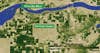
Crop Circles–in a Near-DesertAgriculture is transforming landscapes in the water-strapped West
Lush, unnaturally symmetric fields of wheat, potatoes, poplars and other crops dot parched northeast Oregon in this image taken last August by NASA’s Terra satellite. A high-resolution sensor on the satellite gauges plant photosynthesis, which is scaled to color here: The darker the green, the denser the vegetation. Plant growth, or lack thereof, is a key indicator of drought. The circular shapes result from pivot irrigation systems-outsize lawn sprinklers-that pull water from the Columbia River. _Terra _ ‘s data can also be used to make fast, accurate maps of how much water is consumed by individual fields to help manage water supplies. Given the agricultural and consumer demands on the Columbia River, the U.S. Department of the Interior predicts that there is “substantial” potential for a water crisis by 2025, when demand would outpace supply. You can also see this image on our [Google Earth Layer