Jittery Pixels; Everything Garbled
Learn about JPEG, lossy compression, and the one artifact that doesn't belong in a museum
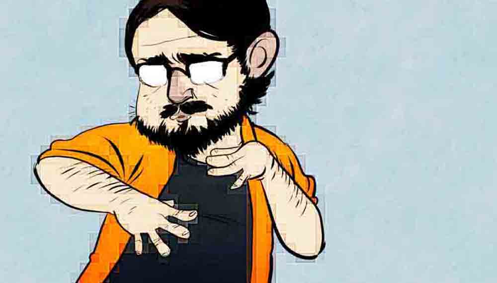

You may have been wondering where I’ve been lately. I didn’t go anywhere, it’s just that a bug in the way PopSci’s website handled images caused my comics to go all fuzzy. Not all was lost, though! While I was waiting for the web team to fix it, I spent the time learning about something I do every single day: Compress images.
One could argue that one of the biggest game changers for the young internet was images that took up less space, and could therefore be transmitted faster. Most image formats, such as gif1, tiff, or png are considered lossless files. While non-compressed images are vital for print and photography, they’re a too cumbersome for everyday image viewing. That’s where the ubiquitous JPEG comes along. Developed by the ISO/IEC JTC 1, a joint technical committee of the International Organization for Standardization (ISO) and the International Electrotechnical Commission (IEC), the JPEG file format and Lossy compression algorithm was designed to provide a standard file format for making image files smaller.
Image compression is a boon upon the internet. But it is not without hazards: If a file is opened, changed, and recompressed too often (or even saved at a low quality setting the first time around) you can get some nasty compression artifacts. This is why digital artists and photographers always work from a lossless version or a raw, layered file—compressing the final product before publishing.
Lossy compression is incredibly mathy and complex, but fascinating to read about. If you liked today’s comic, and want a deeper understanding, pop over to EE Times for a real step-by-step. It’s amazing how quickly the algorithm reveals itself when you look closely at a heavily compressed JPEG. Funnily, the one time I actually want jpeg artifacts, I had the hardest time producing them. Much of this is because of the nature of lossy and my art style. Lossy handles flat gradients pretty well, so I had the hardest time getting a good example of color distortion, while the hard line contrasts produced tons of ringing.
Pronounced with a hard G! It doesn’t stand for “Giraffe-ic Interchange Format”. ↩︎