Animated Map Visualizes Greenhouse Gas Sources
Where U.S. carbon dioxide emissions come from...and where they go.
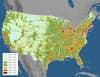
Vulcan CO2 Map
A new system for mapping carbon dioxide emissions in the U.S. will help regulators figure out exactly where these emissions are coming from and how best to reduce them. Among human-produced gases that contribute to climate change, carbon dioxide is public enemy number one.
A group of researchers at Purdue University, led by atmospheric scientist Kevin Gurney, created the interactive mapping system. Called Vulcan, the system tracks the hourly output of carbon dioxide—emitted when fossil fuels such as coal and gasoline are burned—from factories, power plants and other sources across the country. Vulcan shows carbon dioxide emissions at a scale that is 100 times more detailed than previous maps.
Vulcan has already revealed that the southeastern U.S. is a much more important source of emissions than previously realized. Also, the maps reveal that much of the carbon dioxide gas emitted into the atmosphere gets blown toward the north Atlantic.
Animated versions of the map [see video below] show how emissions fluctuate from day to night, and from summer to winter. For example, scientists have discovered that some regions experience huge releases of carbon dioxide in the late winter. The Vulcan data is available for anyone to download. The researchers are also working on a mapping system called the Hestia Project, which will quantify carbon dioxide emissions around the planet.