3-D Map Of Earth Shows Real-Time Weather
One of our 15 favorite recent data visualizations
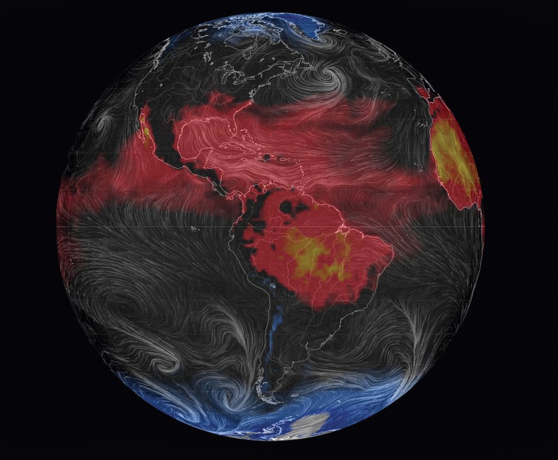
Like the planet itself, some data is constantly changing—so a static visualization will always be out-of-date. Cameron Beccario’s animated globe displays real-time data, at least to within three hours. Each time a user loads the web page, it shows the weather everywhere. Wind appears as gray lines with a so-called misery index—wind chill and heat index—as color underneath. Inspired by a live U.S. wind map published by visualization researchers in 2012, Beccario’s project can also display ocean currents and cloud cover. This view, from August 29, shows post-tropical storm Cristobal off the coast of Canada.
See all 15 of our favorite recent data visualizations here.
This article was originally published in the November 2014 issue of Popular Science, under the title, “Dawn of the Data Age.”