See when COVID-19 could hit your state hardest
These graphs show where we are in the course of the pandemic, based on the most recent data.
Follow all of PopSci’s COVID-19 coverage here, including the most recent numbers, tips on how to make your own masks, and advice on what to donate for health care workers.
Note: this article was originally published April 3, and has been updated to include more current projections and information
In the midst of a crisis, everyone wants to know when it’s going to be over. That’s especially true right now, as many of us are sheltering in our homes to flatten the COVID-19 curve, and hoping things are at least moving in the right direction. So where are we in the course of this global pandemic?
The short answer is that we don’t—and can’t—know for sure. COVID-19 is unlike anything we’ve seen in the last 100 years, and given how much the world has changed since our last devastating upper respiratory pandemic, we can’t predict exactly how the disease will play out. But as researchers gather more and more data, they’ve started to be able to create models of how the novel coronavirus might spread and how big the impacts could be.
One such team at the Institute for Health Metrics and Evaluation came out with a model at the beginning of April that projects when the peak of the pandemic might hit each state, which estimates when we would need the most hospital and ICU beds. Their model incorporates the various social distancing measures implemented in each location thus far (and assumes that any states that haven’t already implemented the highest level of social distancing orders will do so within the next seven days). It assumes that these measures will be in place at least until the end of May.
Based on case count data released on April 7, their current model shows that the first wave could be over by early June. The top of the curve will likely occur around April 11, then run into May, though the disease will run its course differently in each state. At its peak, they estimate we’ll need 94,249 hospital beds and 19,438 ICU beds nationwide. Based on their data, that means we’ll be short more than 15,852 hospital beds and nearly 9,047 ICU beds. But the situation looks very different when you break it out into individual states.
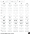
A few states overshadow the rest, taking up the bulk of the total hospitalized patients. New York is by far the highest peak, with New Jersey, Connecticut, Massachusetts, and Florida. Prior models showed that Alabama, California, Florida, Illinois, and Texas would peak much higher, but the newer model shows those states might not be hit as hard.
It’s easier to get a sense of what might happen in any individual state by looking at each curve of cases on its own scale, so they don’t all pale in comparison to population-dense New York.
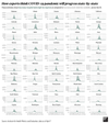
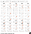
The earlier model at the beginning of April showed that many states would be likely to exceed the number of hospital beds they have available. This newer version shows fewer, though some with relatively low case numbers in absolute terms, like Connecticut and Rhode Island, are projected to run out of room. Some are in a grey area, where their totals might go over their available beds based on the current projection, but it’s still possible they might stay under capacity.
The peaks also vary in timing quite a bit. New York may have just hit its peak, and many states hit early on are likely to be on the downswing by May, while others will still be hitting their stride and ramping up new cases in the middle of that month.
The situation is more dire for ICU beds. These are needed only for the sickest patients who are at the highest risk of dying without aggressive medical attention, but many states are poised to be in short supply regardless of their overall case numbers. Some will be short by hundreds or thousands of beds.
Shortages like this will mean that healthcare providers will be forced to take care of patients in suboptimal conditions and possibly to make difficult decisions about who gets life-saving care.
It’s also important to remember that when we talk about exceeding the number of hospital beds available, we’re not leaving any extra beds to treat people with conditions other than COVID-19. People don’t suddenly stop needing medical attention during a pandemic, and though stay at home orders mean fewer car accidents and other injuries, plenty of people without COVID-19 still need to be hospitalized, or even put in intensive care. If all of the beds need to be prioritized for those sick with the novel coronavirus, that leaves absolutely no room for folks with other ailments.
The IHME team estimate around 81,000 US deaths in total for this wave of the outbreak, though uncertainty in the model means it could be anywhere from roughly 50,000 to 136,000.
The important thing to remember is that these predictions aren’t perfect and they’re changing rapidly. This is a health crisis of a scale that no one alive has really seen, so it’s to be expected that even our best estimates would change as the situation progresses.
Since the last update on April 2, the IHME team has gathered more data and information, and used that knowledge to improve their model. The system is based primarily on extrapolating the number of hospital and ICU beds based on the number of COVID-related deaths recorded by each state. This has the advantage of keeping the model from being dependent on the variation in testing rates across the nation, but it means that the estimates change as more patients are treated. The more data there is on how long patients stay in the hospital or ICU—and how many of those patients die—the better IHME can predict how many total beds will be required. They’ve also updated how they give weight to different social distancing policies to better reflect what’s happening on the ground, and added new data sources.
Each day there’s also a new influx of numbers on how the pandemic is progressing in each state, and as our social distancing measures start to pay off it’s natural that the estimates will change to reflect that. It would be easy to interpret the decrease in estimated severity as an indication that we overreacted or that health officials were misleading us. But it’s crucial to remember that having a lower peak means that, in fact, we reacted appropriately. Had we not implemented strict social distancing and lock down procedures, things would have been far worse.
It’s also worth noting that these models are based on strict and widespread social distancing that lasts through May: Staying in shutdown for longer will help ease the burden on the healthcare system, which will save lives. If restrictions ease up in the wrong places too early, cases of the disease could surge all over again.
These predictions also don’t include any secondary (or tertiary) waves, which infectious disease researchers currently think are likely to happen once folks are out in public areas and able to spread COVID-19 once more. It’s impossible to know right now how those later waves will turn out. They could be far less dangerous, since herd immunity will be higher and demands on the healthcare system will likely be lower. But it’s also possible that, like the 1918 flu, the second and third waves could be deadlier (many think the influenza virus developed a new mutation that increased the impact of those waves, but others are skeptical). Until vaccines are ready for general use—which will likely take around a year, if not a bit longer—we must be prepared for future peaks of COVID-19 to be as deadly serious as the initial one that we are currently in.
While these graphs shouldn’t be taken as a guaranteed predictor of your state’s COVID-19 outcomes, there is one message you can absolutely take away from the data: The important thing right now is to continue to stay home. The better we all hunker down, the sooner we’ll be able to come back out again.