A Map of Death
Ever wondered the likelihood of dying in a natural disaster like an earthquake or hurricane? A new mapping tool shows just that
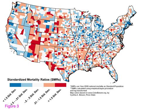
Geographers from the University of South Carolina have created a map of the United States depicting a county-level representation of natural-hazard-related deaths — the first systematic attempt to look at mortality in this way. While highly publicized media reports on catastrophes like Hurricane Katrina and the wildfires in Northern California may lead the public to believe these disasters are the most deadly, it is actually extreme weather — the very hot summers and very cold winters — that cause the most deaths.
Heat and droughts caused the most deaths at 19.6 percent, followed by severe summer weather at 18.8 percent and winter weather at 18.1 percent. Together, earthquakes, hurricanes and wildfires made up only 3.4 percent.
According to Susan Cutter, co-author of the study, the mortality map has applications for emergency response to both natural disasters and terrorist attacks. While the causes of these types of events are very different, there are many parallels in the way that emergency workers respond, a fact not lost on the Department of Homeland Security, which funded the study.
“I think it has a significant utility for emergency preparedness and response, particularly in those areas identified as hazard mortality ‘hot spots’. If we can figure out what is contributing to that, it may assist in helping state and local governments to do a little bit better job at preparedness, including communicating information to rescuers,” Cutter said.
Making the Map
The data for the map was pulled from Spatial Hazard Events and Losses Database for the United States (SHELDUS), a database of financial loss and fatalities due to 18 different types of natural disasters. SHELDUS was created by SC researchers in 2000, and now represents the best inventory of natural hazard losses in the country.
Mortality data from SHELDUS was normalized according to population and age, standard protocol in this type of map-making. This normalization helps geographers compare one area of a region to another. If population isn’t normalized, then areas of high population like New York will appear to have a much larger mortality rate than areas like rural Kansas. Age is normalized because locations with high elderly populations may pop up on the map as hot spots, when in fact most of the deaths were actually due to old age.
While SHELDUS data extends from 1960 to the present, Cutter and her team used data from 1970 to 2004 for the current study, because this timeframe had the best mortality data. The group is currently working on adding data from 2004 onward, to capture information from events like Hurricane Katrina, as well as pulling the data from the 1960s so that they have a longer overall record.
After that is complete, they’ll rerun the analysis and start looking into specific states or clusters. This may help answer the question “why here and not there” with respect to certain types of deaths, said Cutter, particularly those that could have been prevented with better preparedness.
Aside from the emergency response applications, Cutter said she made the mortality map because “geographers map everything. It is what we do. Mapping reveals interesting relationships, and we can use it as an effective exploratory tool.”