How The Internet Has Spread Around The World [Infographic]
The World Wide Web is really starting to look like, well, a world wide web.
When Tim Berner-Lee invented the World Wide Web in 1991, it was a bit of a misnomer–at the time, virtually all of the world’s five million internet users were concentrated in just 12 countries, and 70 percent were dialing up from within the United States alone.
But, as today’s infographic demonstrates, the WWW has become significantly more worldwide over the past two decades. By 2010, more than 2 billion people–or about one-third of the global population–had access to the internet, up from something like .05 percent in 1990, and less than 10 percent of users worldwide now reside in the U.S:

by jkan. Check out our data visualization blog.
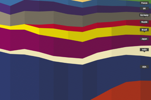
This infographic does an excellent job of showing two big trends: the geographical diversification of the web, and China’s sudden expansion and global dominance as an internet presence.
But I found some of the trends in the chart perplexing–what does it mean, for instance, that Malaysia makes an appearance on the chart in 1998, but then disappears around 2009? Is it just that Malaysia’s population wasn’t growing fast enough to make it visible on the chart, or did the spread of internet access in Malaysia suddenly slow? And did the sharp decline of U.S. users relative to the rest of the world reflect a lack of growth in the U.S., or just a sharp increase in other places? Clearly, China’s population is much larger than the United States’s., but that country also has about twice as many internet users. Could it be that a higher percentage of Chinese than Americans have access to the internet?
I found some answers with the help of Google’s public data tool. Take a look at the charts below–the first shows the relative proportion of internet users by country, and the second shows each country’s total number of users:
The chart above shows that the relative proportion of internet users has been rising pretty much everywhere. The recent economic recession in the U.S. is a notable exception–the proportion of users actually fell by about three percent between 2007 and 2009, and overall the rise in internet users has been slower in the U.S. than in many other countries since around 2001 (could the kink in that line be the dot com bubble bursting?). China’s internet explosion is also notable here, as one of the steepest increases of the past several years, but it’s even more impressive in this chart, which shows total internet users by country:
That may be the steepest line in internet history.