How People Explain Color Throughout The World [Infographic]
This clever color wheel reveals how different languages explain the color spectrum, whether in three words or more than 60 words.
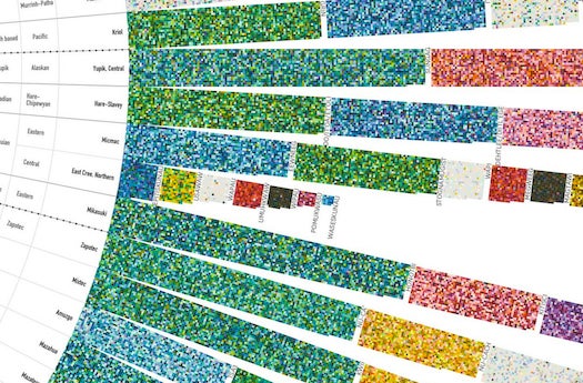
Data interpreter/designer Terrence Fradet created this lovely interpretation of colors through the filter of language. At the Fathom Information Design site, he has a more expansive history on color and language, but this is a short version.
Some languages explain the entire color spectrum in two or three words–eschewing everything except maybe “light” or “dark”–while others might classify more than 60 relatively obscure colors. The World Color Survey is a global database of color names and interpretations, and Fradet mined this data for his infographic. The results are grouped by geographic area and show the most-used words nearest to the center, reaching out to the most obscure variations at the end.
Read more about it at Fathom.