What’s really going on with sea level rise
Even the best data can be presented in misleading ways.

In 1995, McArthur Wheeler robbed two Pittsburgh banks without so much as a mask, writes William Poundston in the book Head in the Could: Why Knowing Things Still Matters When Facts Are So Easy to Look Up. Wheeler, you see, believed that a coating of lemon juice he’d rubbed onto his face would make him invisible to the banks’ security cameras. Shockingly, it didn’t. A local television show broadcast the footage, a tip came in, and cops appeared at Wheeler’s door. “But I wore the juice,” he reportedly said in astonishment.
It’s easy to laugh at Wheeler: most of us think that we could never be so blinded by our own biases. But when it comes to climate change, so many of us are. For example, lately some have promoted the idea that NASA’s data on sea level rise—strongly associated with a warming climate and melting polar regions—shows that it’s slowing down. It isn’t. Global sea levels are still rising. So where did this conclusion come from?
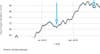
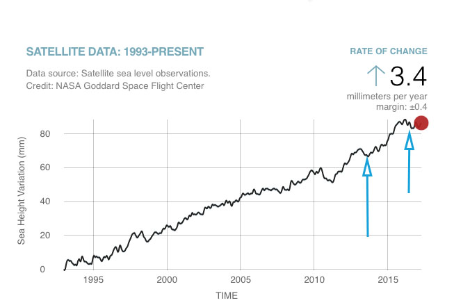
People sharing this false finding usually include some version of the above graph, which shows NASA satellite data on sea level rise. It can leave one with the impression that sea level is declining. But that’s only because it takes a small amount of data out of context. If you zoom out, you see that the above dip isn’t the result of a decline—it’s just natural variation, which happens with all sorts of phenomena.
Try to think of it the way you’d think about weight gain. If you hopped on the scale after putting on 40 pounds in a year and noticed you were three pounds lighter than the month before, you’d be foolish to conclude that your weight was on the decline. You need to see sustained weight loss over time to make that judgment. After all, the human body can lose three pounds after a good poop.
This variation on the widely-shared graph is the planetary equivalent of a good poop: sometimes sea levels fluctuate a bit from year to year, but that doesn’t change the fact that things are rising overall. To confirm this PopSci emailed Tapio Schneider a climate scientist at Caltech who works with the NASA Jet Propulsion Laboratory (who puts up the data).
“For example, some winters, more snow accumulates on continents than usual,” Tapio Schneider told PopSci via email. “When that happens, water that otherwise would be in the oceans is locked on land, until it thaws and flows back into the oceans. Or, temperature fluctuations lead to temporary warming or cooling of ocean waters. Because water expands as it warms, warming raises sea level (and cooling lowers it)—even when that warming or cooling is temporary.”
So within a long-term trend of sea level rise, Schneider explained, you’re bound to see short-term fluctuations.
“It would be a mistake to try to infer any climate trend from a few years of data,” he said. Sea level for the past year or two seems relatively flat, based on satellite measurements, but records show a gradual increase stretching back to at least 1870. In fact, Schneider added, the sea level curve in the past couple of years is probably just the result of especially high levels in 2015. A strong El Niño—a natural climate fluctuation that makes certain years particularly hot—bumped sea levels up temporarily.
“When one looks at trends over decades, it is clear that sea level is inexorably rising,” Schneider said. “We expect that long-term trend to continue as long as the climate warms—both because warming waters expand and because melting land ice contributes to sea level rise.”
In other words, wishing a thing doesn’t make it so. The seas are still rising, the Great Barrier Reef is still bleaching, the polar ice caps are still melting, and as our streak of record-breaking global temperatures shows, climate change is still happening.