The Geography Of Twitter Conversations
One of our 15 favorite recent data visualizations
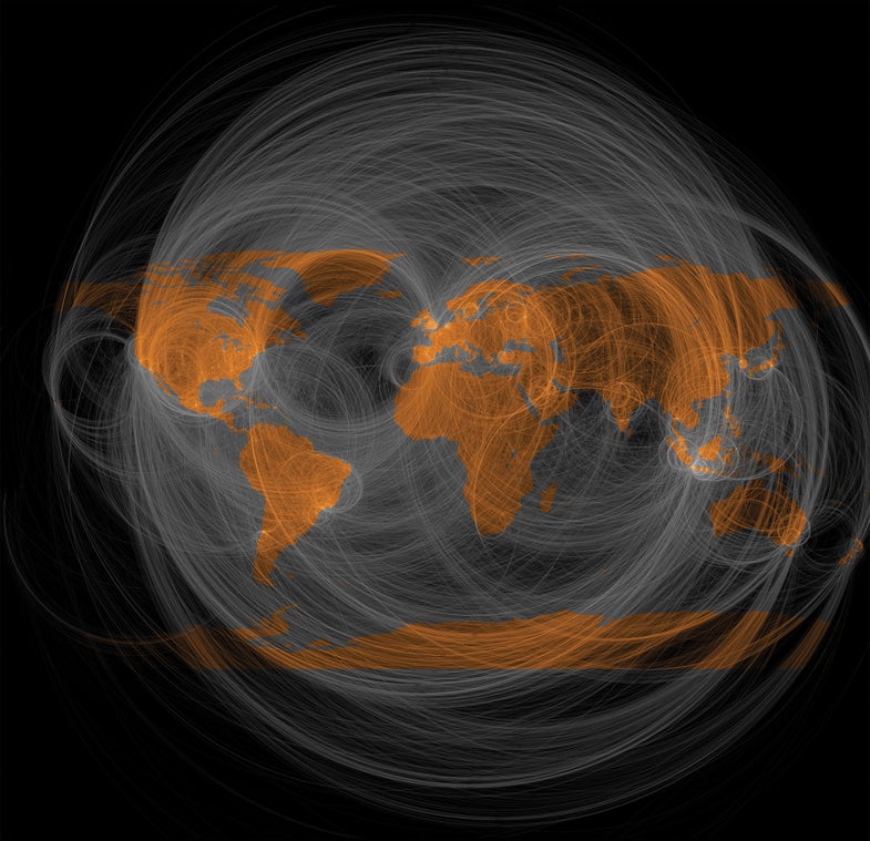
Eric Fischer makes maps to understand how people interact with each other and their environments—and there are few better windows into relationships than social media. In this map, he charted public conversations between people on Twitter for five months in 2011, showing how the service connects distant places. A single reply—a type of tweet that starts with another user’s handle—appears as an arc. The more frequently people in different cities communicate with each other, the brighter those arcs appear. The map also encodes the direction of the communiqué. Each missive moves clockwise: A tweet from Los Angeles to New York arcs across Canada, while one moving the other way arcs over Mexico. Thus, the balance of these conversations stands out: Nearly every arc has a companion below it, creating circles of global connection.
See all 15 of our favorite recent data visualizations here.
This article was originally published in the November 2014 issue of Popular Science, under the title, “Dawn of the Data Age.”

Twitter Reply Geography