The Felton Annual Report: A Year’s Worth Of Communication In One Chart
One of our 15 favorite recent data visualizations
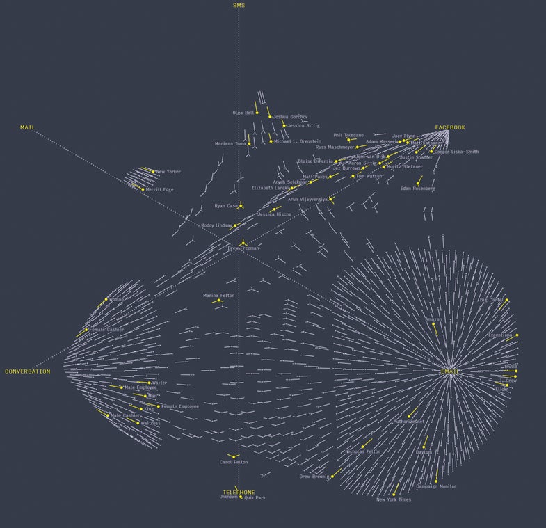
For nearly a decade, Nicholas Felton has been observing himself and using the information he collects to create a mock corporate annual report. In 2013, he tried to record and render all of his communication. Some channels, like text messages, were easy to track. Others, like phone calls or in-person conversations, required him to write down the length, topics, and participants of every encounter—a huge task. Here, each dot is one of the 1,000 people Felton talked with most. The lines represent the fraction of their conversations that occurred in one medium or another, creating a natural hierarchy. Colleagues appear near the email node, while close friends gravitate to the text-message node (labeled SMS here). Halfway between in-person conversation and email—near telephone but far from text messages—is his mother, Carol.
See all 15 of our favorite recent data visualizations here.
This article was originally published in the November 2014 issue of Popular Science, under the title, “Dawn of the Data Age.”
Feltron Annual Report 2013