Are Your Wrists At Risk For Carpal Tunnel Syndrome?
Daily mouse usage may lead to neuropathy, but also beautiful graphs
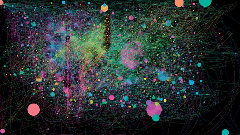
The IOGraph app turns computer-mouse movement into art that reflects motion and idling. The prevailing belief is that intense mousing can compress the median nerve and cause carpal tunnel syndrome (CTS), which affects three percent of U.S. working adults. But that connection has been hard to prove. While a February 2014 meta-analysis couldn’t establish a causal link between desk-job activity and CTS, a computer simulation from September showed that mouse use can indeed deform the median nerve. So the debate continues.
The staff at Popular Science tried out the IOGraph for a day, to see what we could learn. In the resulting graphs (above and below), lines trace the path of the mouse across the screen, while circles represent idling time. The images reveal differences in each user’s mousing behavior.
Executive Editor Jenny Bogo had three long meetings on the day she tested IOGraph, resulting in the big circles in the graph above.
It looks like Information Editor Katie Peek, who generated the graph below, was fortunate enough to avoid those meetings. “I spent my morning doing design work, which means I do a lot of diagonal mouse movements as I zoom in to different areas of an illustration,” she says. “But that’s mostly overwritten my by afternoon work (since later movements show up on top), when I was judging candidate entries for our Vizzies science visualization competition. It involved entering score after score into a drop-down web menu, so I did a lot of vertical mouse motion as a result. Those are the pink lines on the top layer of my image, toward the left.”
Testing out the IOGraph on a few people in just one day couldn’t tell us a lot about whether or how our individual mousing patterns might be influencing our wrist health, but it did generate some beautiful images. Says Peek: “I’m extremely pleased with how much my IOGraph resembles the continental U.S.”

More Mouse Movements
This article was originally published in the January 2015 issue of Popular Science. It has been expanded for the web.

Mouse Movements