A Map Of Winds All Over The World
See high-speed winds and cyclones over the sea.
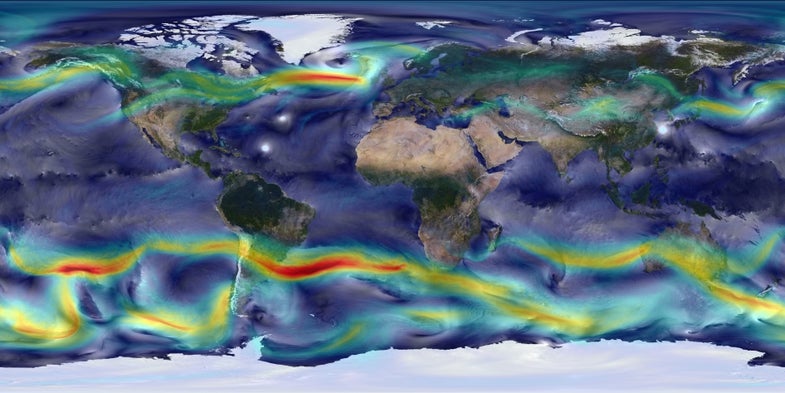
Aeolus, is that you? This is a map of winds on Earth, created from a mathematical model made by NASA. Scientists ran a complete simulation using the model, representing the movement of winds and other atmospheric phenomena on Earth from May 2005 to May 2007. This image shows one snapshot from that two-year “Nature Run.”
“The idea is to provide a high-resolution version of what the atmosphere looks like at any given time,” Bill Putnam, one of the creators of the model, tells Popular Science.
You can see surface winds—the stuff you feel, standing there on the surface of the Earth as the mere mortal you are—in white. The bright white circles you see over the Atlantic Ocean and the East China Sea are cyclones. Meanwhile, the colored streaks represent upper-level winds at an elevation about 33,000 feet above the surface of the Earth. The upper-level winds’ colors represent their speeds, which range from 0 to 175 meters per second (a little more than 390 miles per hour). The red winds are the fastest.
NASA’s satellites gather plenty of real-world data about the winds and other atmospheric phenomena on Earth. This data go into the model, called the Goddard Earth Observing System Model or GEOS-5, four times a day. Additional calculations in the model then help fill in swaths of the globe that satellites don’t happen to cover, Putnam says.
GEOS-5 also models surface temperatures on Earth; precipitation; and the movement of dust, sea salt, carbon and sulfates all over the globe. You can see results for those things here.