Popular Science+ Comes to the Samsung Galaxy Tab
Check out our new special issue, designed exclusively for the Samsung Galaxy Tab
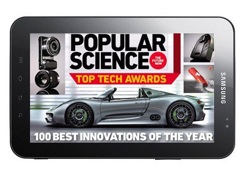
We’re excited today to unveil our latest digital publishing project, Popular Science+ Top Tech 2010, a special issue of the magazine designed specifically for the Samsung Galaxy Tab. Built on the same platform as our iPad version, Mag+, PS+ Top Tech 2010 brings our blockbuster Best of What’s New product awards to Samsung’s new 7-inch tablet.
PopSci is always interested in being in front of the latest technology, so we were eager to try pushing Mag+, now home to six magazines on the iPad, to Samsung’s new device, both to reach the scores of people buying the Galaxy Tab and to see what it means to design a magazine in the 7-inch space, as well as to bring the platform to the Android OS. Mag+ is built on the notion that magazines should feel truly native to the device they’re being consumed on, and present the best possible reader experience, so we figured a special issue, centered around our most popular package of the year, would be a great way to learn and get feedback on what’s working and what we still have to work on. We’ll keep experimenting on this and other tablets moving forward and are eager to hear from readers of the new app. Here’s some of what we took out of this exercise:
Screen shape matters more than screen size
As we began adapting the layouts for this screen, we found that what necessitated rethinking even more than the smaller size was the wide-screen (1024×600) format of the device. Simply having a different shape to the creative canvas means you need to re-examine the relationship between elements on the page. The solution is to make the pages simpler and more hierarchical, as you have less room for multiple elements interacting in the same visible space. In this way, we can keep a beautiful, immersive presentation that doesn’t make the screen feel crowded.
Orientations become more distinct
The more rectangular wide-screen shape means there’s more difference between the vertical and horizontal orientations. For instance, to keep type at an easily readable size and in a column of sufficient width, the vertical orientation creates a lot of overlap between text and images. So we decided to lock orientation to the horizontal, which gives the images and text more room to breathe, while still using the layered presentation unique to Mag+ to create that feeling of dynamic and interactive stories, with new images moving into place as the user scrolls the text. We also of course kept the Mag+ feature that lets you turn off the text and focus solely on the images.
It’s still a big enough canvas for design
Although it requires more simplified layouts, the 7-inch wide-screen display still gives designers enough space to be graphic and create deliberate layouts—unlike, say, 4-inch smartphone screens, which offer the best experience when made entirely hierarchical (imagine your favorite newsreader app with a full screen of text).
There’s great potential for multimedia
The wide-screen format really shines at showing off HD videos, so we’re interested in further exploring integrating that content into publications, particularly in the full-screen style overlapping with content, which is unique to Mag+.
What else would you like to see on the Galaxy Tab? Let us know in the comments.